Following my plans to improve my documentary from my audience feedback comments, below is the final version; with a shorter duration of location shots, and a longer duration of text to make this easier to read.
The Role of Sexism from Courtney O'Donnell on Vimeo.
TV listings magazine final:
Click to enlarge or download the higher quality, original file here.
Newspaper advertisement final:
Also click to enlarge or download the higher quality, original file here.
Showing posts with label ancillary products. Show all posts
Friday, 27 March 2015
Thursday, 26 March 2015
Audience Feedback
After receiving audience feedback from my older demographic within my interview with the representative of this audience, Mr Mooney, I have collected feedback for all of my products from my younger audience demographic, by targeting them online through social media. I have presented and analysed this feedback below using Emaze.
Genre, Audience and Exhibition
I have presented the genre, audience and exhibition research of all of my three productions within the Prezi presentation below.
Sunday, 22 March 2015
Final Newspaper Advertisement
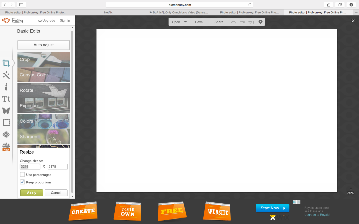
I have edited my newspaper advertisement using PicMonkey to;
I then discovered from researching Channel 4's advertisements online, that the institution represents brand identity through a specific layout, font and use of text boxes; which is instructed within the Channel 4 style guide. I used this as a guide for formatting my advertisement.
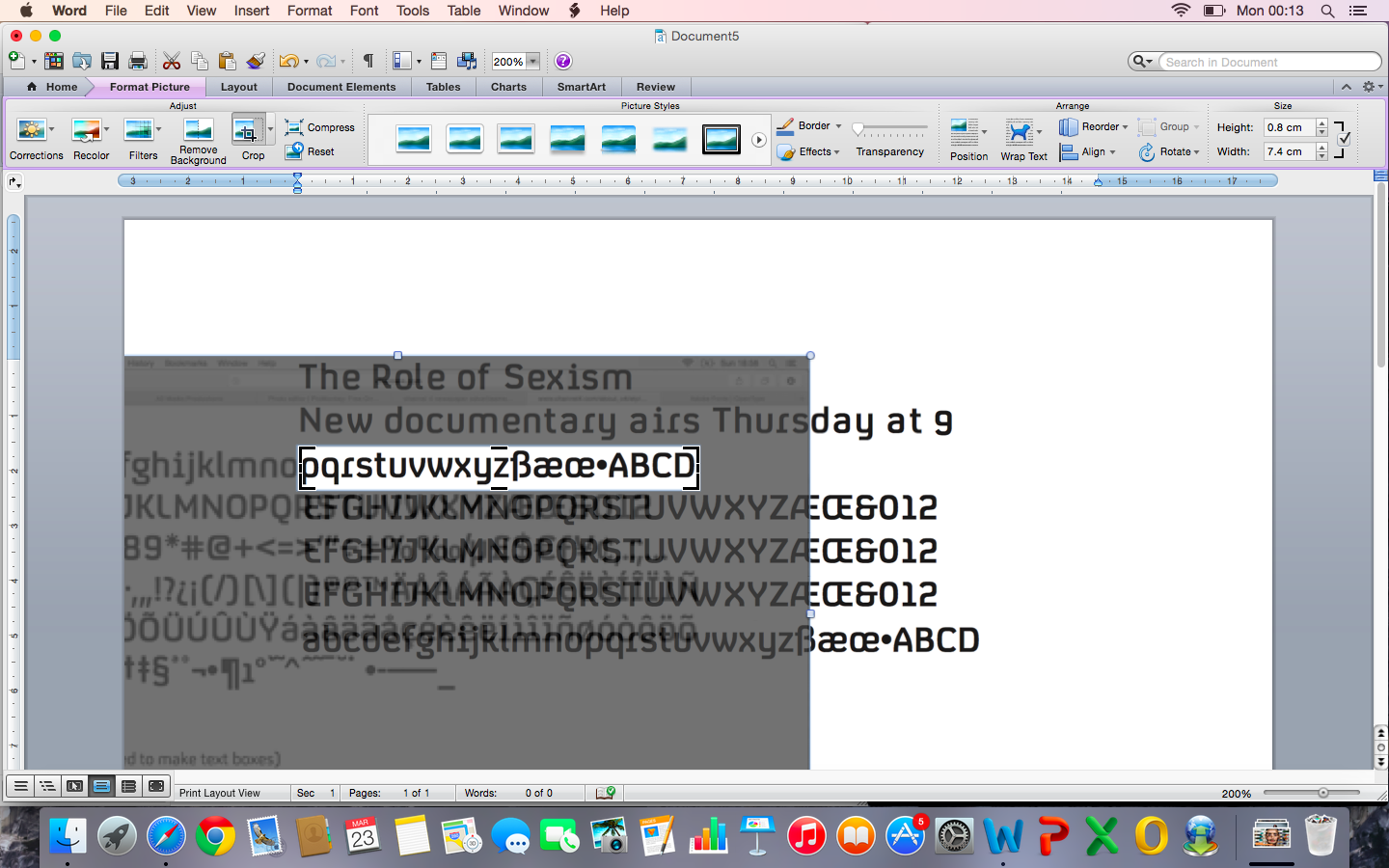
One of the things I found was that Channel 4 have their own specific font named 'C4 condensed' for all promotions and off-air usage, which can only be used through Open Type. I researched how to use/ download this software, but as it had to be purchased, I screenshotted the font examples from the guide, and cropped the letters I needed on Microsoft Word in order to follow the conventional, strict layout of the brand I'm representing.
The title and subtitle also follow Channel 4's conventions as all print advertisements include the programme's main title, and scheduling information for the subtitle, as found from my research into genre and the guide. I then screenshotted these and added them to a new document over my background image - which I measured as 25.9mm (w) x 15.5mm (h) to suit my exhibitor's format. I cropped around their white background to form the Channel 4 textboxes, and positioned them conventionally against the lower left edge of my background.
The Channel 4 logo was also guided to be placed 10mm (in relation to my advertisement dimensions) from the centre of the right edge of my background. I downloaded and overlaid the conventionally white logo, and adjusted the height with Microsoft Word's ruler to 5.2cm, as its height = the heigh of my advertisement x 0.333 according to the guide.
Finally, following Channel 4's guided conventions, I added a short url of the proposed webpage for my documentary on the Channel 4 website, in the same simple, rounded, small font and position.
Above is a screenshot of the final version of my newspaper advertisement, which I will be printing due to its failure to upload to SlideShare, and in order to print the accurate dimensions. Overall, I feel that it is appropriately attractive to my younger demographic due to the vibrant, artistic colour scheme, which is appropriate for my 'i' exhibitor, and also represents and creates an enigma for my documentary through the semiotic of the music industry with my headphone mise en scene, and educated/ information with the bookshelf. This use of interpretative semiotics is also conventional to Channel 4 newspaper advertisements, which links my ancillary product to my documentary exhibitor. The costume, model, setting and style of photography also links to my listings magazine and documentary effectively, forming relating, supportive products. Finally, I have met my conventions of formatting with great detail from following the Channel 4 style guide throughout my editing, resolving the issue of fonts by individual cropping them, and from deconstructing the 'i' newspaper in this post.
- crop to the proportions of 'i' landscape advertisements
- adjust the rotation of the image, making the bookshelf lines straight and therefore aesthetically pleasing
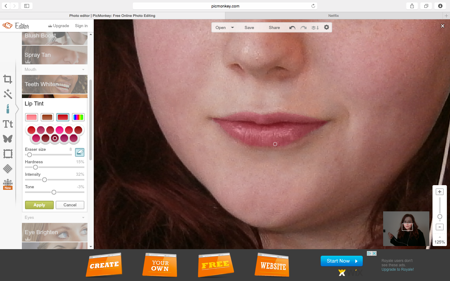
- enhance Rowan's features and hair using the blemish tool, lip tint, smooth to remove shine, and the red tint to enhance and brighten the colour of her hair
- contrast, brightness, shadows, highlights and saturation to enhance the colours of the image
- use the black and white effect which I erased over Rowan to de-saturate the background, drawing more attention to Rowan as the focal point, and then use on an additional layer to remove the yellow tones from the bookshelf
- soften the background to make it less in focus, drawing attention to Rowan and following the conventional style of 'i' newspaper advertisements, as found within my deconstruction post
I then discovered from researching Channel 4's advertisements online, that the institution represents brand identity through a specific layout, font and use of text boxes; which is instructed within the Channel 4 style guide. I used this as a guide for formatting my advertisement.
One of the things I found was that Channel 4 have their own specific font named 'C4 condensed' for all promotions and off-air usage, which can only be used through Open Type. I researched how to use/ download this software, but as it had to be purchased, I screenshotted the font examples from the guide, and cropped the letters I needed on Microsoft Word in order to follow the conventional, strict layout of the brand I'm representing.
The title and subtitle also follow Channel 4's conventions as all print advertisements include the programme's main title, and scheduling information for the subtitle, as found from my research into genre and the guide. I then screenshotted these and added them to a new document over my background image - which I measured as 25.9mm (w) x 15.5mm (h) to suit my exhibitor's format. I cropped around their white background to form the Channel 4 textboxes, and positioned them conventionally against the lower left edge of my background.
The Channel 4 logo was also guided to be placed 10mm (in relation to my advertisement dimensions) from the centre of the right edge of my background. I downloaded and overlaid the conventionally white logo, and adjusted the height with Microsoft Word's ruler to 5.2cm, as its height = the heigh of my advertisement x 0.333 according to the guide.
Finally, following Channel 4's guided conventions, I added a short url of the proposed webpage for my documentary on the Channel 4 website, in the same simple, rounded, small font and position.
Above is a screenshot of the final version of my newspaper advertisement, which I will be printing due to its failure to upload to SlideShare, and in order to print the accurate dimensions. Overall, I feel that it is appropriately attractive to my younger demographic due to the vibrant, artistic colour scheme, which is appropriate for my 'i' exhibitor, and also represents and creates an enigma for my documentary through the semiotic of the music industry with my headphone mise en scene, and educated/ information with the bookshelf. This use of interpretative semiotics is also conventional to Channel 4 newspaper advertisements, which links my ancillary product to my documentary exhibitor. The costume, model, setting and style of photography also links to my listings magazine and documentary effectively, forming relating, supportive products. Finally, I have met my conventions of formatting with great detail from following the Channel 4 style guide throughout my editing, resolving the issue of fonts by individual cropping them, and from deconstructing the 'i' newspaper in this post.
Plan and Deconstructions of Newspaper Advertisements
Within the SlideShare presentation below, I have deconstructed four newspaper advertisements from my exhibitor for this ancillary product, 'i', and made comparisons between these. This has allowed me to understand the layout, format and styles of newspaper advertisements within my exhibitor, and plan my ancillary product appropriately.
Newspaper Deconstruction from Courtney O'Donnell
From this, I will begin to design and make my newspaper advertisement ancillary product, whilst referring to this research and plan.
Saturday, 21 March 2015
Final TV Listings Magazine
I used PicMonkey to edit my image and create my background, and then formatted this into the TV listings magazine double page spread using Microsoft Word, due to its precise measurement ruler to accurate follow the Radio Times house style, and more professional text editing tools than PicMonkey.
Overall, I am happy with the professionalism, sophistication and artistic style of this ancillary product, achieved by my conventional, stylistic format to the Radio Times, as well as my youthful and bold photography. The article effectively creates an enigma for my documentary by introducing its theme, relevance to contemporary society and modern culture, features such as interviews and deconstructions, and purpose to investigate sexism within the media, which are conventional aspects to present and advertise programmes within the Radio Times. Furthermore, I feel that I have engaged my audience and readers effectively through my interview with Rowan and descriptions of her as an innovative young presenter; not only creating a connection between the reader and my presenter through this focus, but also engaging young people and justifying my young model, which some older readers may be surprised to see alongside the older adults within this TV listings magazine. Finally, I have included detailed information of when my documentary is scheduled (which is the main purpose of this ancillary product), and accurately met the conventions for my genre and exhibitor.
As my ancillary product was formatted especially to be printed, and because I cannot upload this as a Word document on SlideShare etc. due to my unsupported layout, I will submit this as a printed hard copy. However, below I have added a screenshot of the final version.
The main inspiration for this ancillary product, as analysed in my screenshots:
![]() |
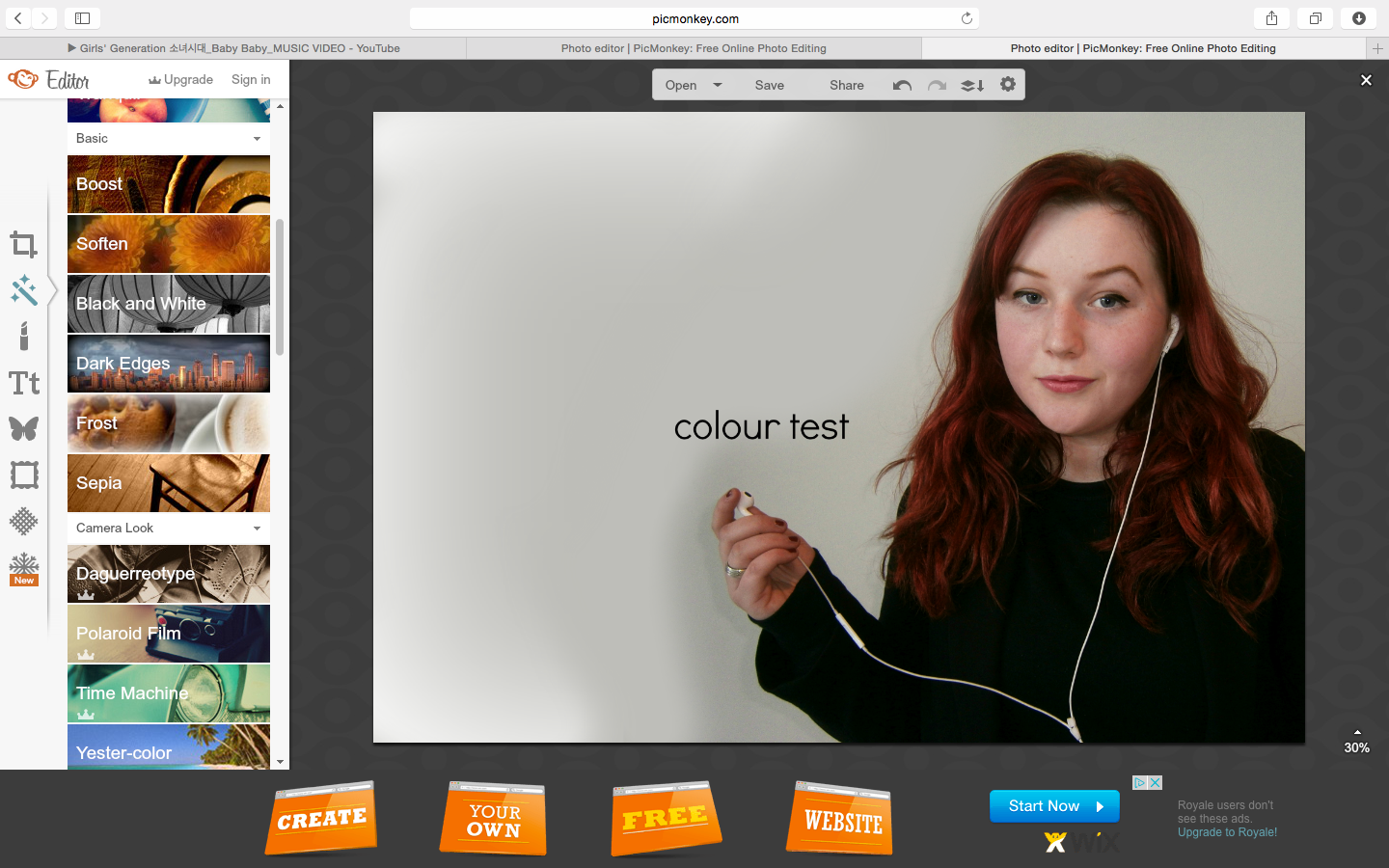
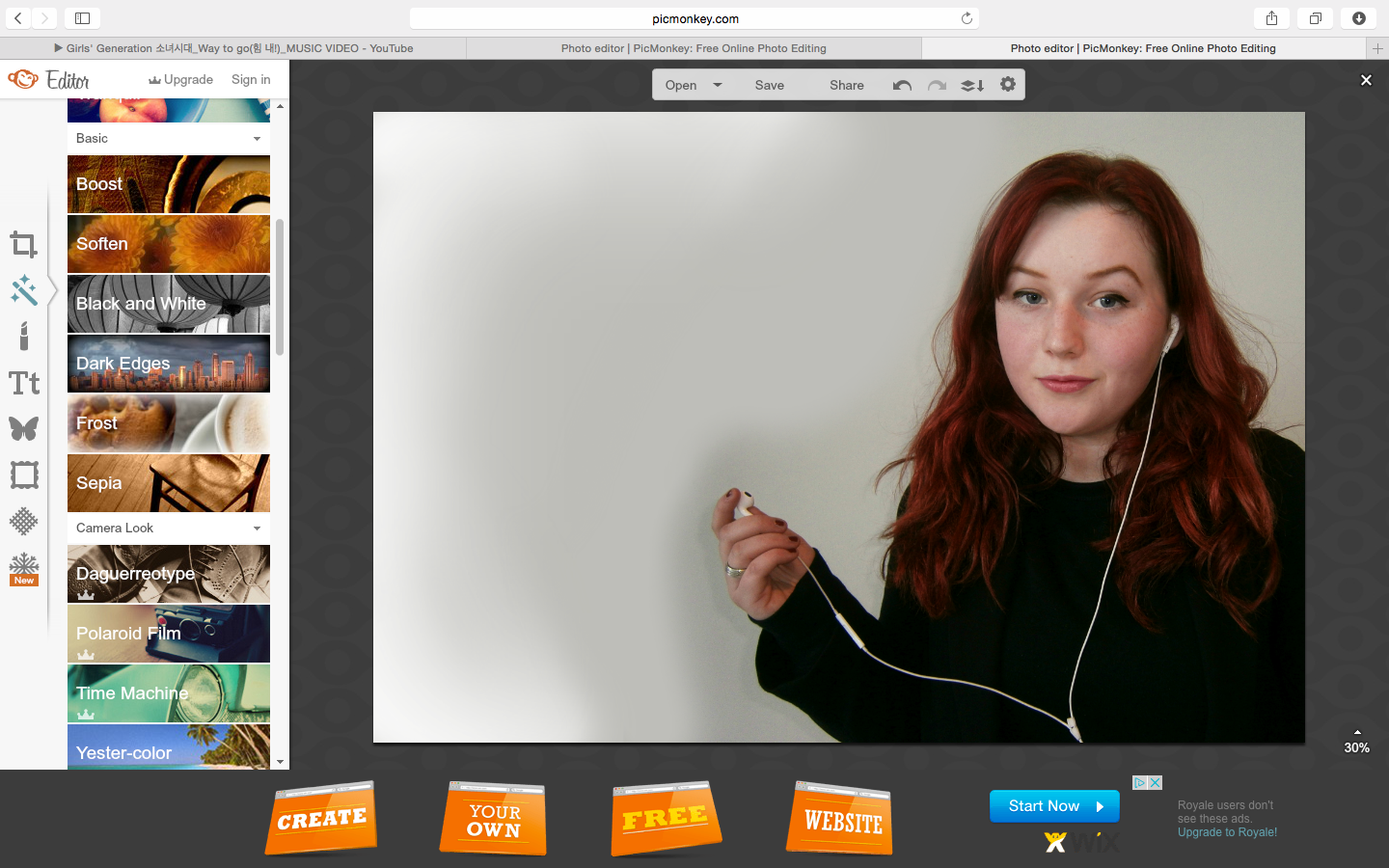
| The basic, limited text editing and formatting options with using PicMonkey. |
![]() |
| Editing the width and height of my image in cm's using Word to the exact measurements of a Radio Times double page spread (which I previously measured from my copy). |
![]() |
| Using the Tabloid Oversize option for my page layout to accurately follow the Radio Time's format and avoid my double page being cropped when printed. |
![]() |
| I added the conventional fine, black line dividing the page numbers and the article, and cropped this at my image to look professional and aesthetically pleasing. |
![]() |
| Adding the conventional Radio Times programming information and dividing line, using the appropriate fonts, sizes and styles for each separated piece of information, which I had to test. |
![]() |
| Adding my catchy image caption, which is conventional to the Radio Times, using the same font styles. |
Overall, I am happy with the professionalism, sophistication and artistic style of this ancillary product, achieved by my conventional, stylistic format to the Radio Times, as well as my youthful and bold photography. The article effectively creates an enigma for my documentary by introducing its theme, relevance to contemporary society and modern culture, features such as interviews and deconstructions, and purpose to investigate sexism within the media, which are conventional aspects to present and advertise programmes within the Radio Times. Furthermore, I feel that I have engaged my audience and readers effectively through my interview with Rowan and descriptions of her as an innovative young presenter; not only creating a connection between the reader and my presenter through this focus, but also engaging young people and justifying my young model, which some older readers may be surprised to see alongside the older adults within this TV listings magazine. Finally, I have included detailed information of when my documentary is scheduled (which is the main purpose of this ancillary product), and accurately met the conventions for my genre and exhibitor.
As my ancillary product was formatted especially to be printed, and because I cannot upload this as a Word document on SlideShare etc. due to my unsupported layout, I will submit this as a printed hard copy. However, below I have added a screenshot of the final version.
The main inspiration for this ancillary product, as analysed in my screenshots:
![]() |
| Article on Jon Snow's Channel 4 documentary within the Radio Times. |
Wednesday, 11 March 2015
Creating my Listings Magazine - Background
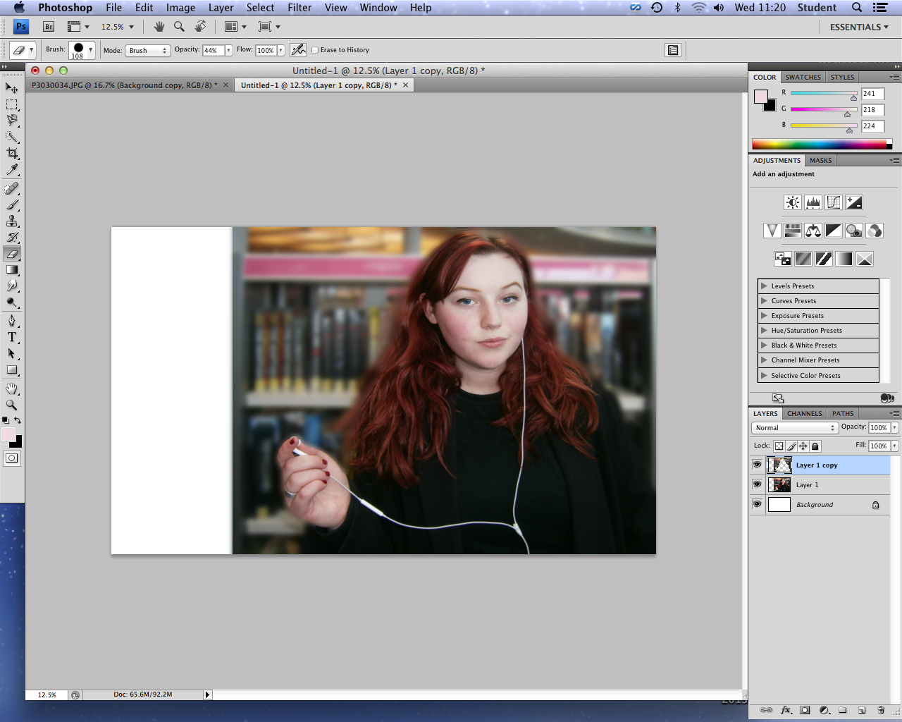
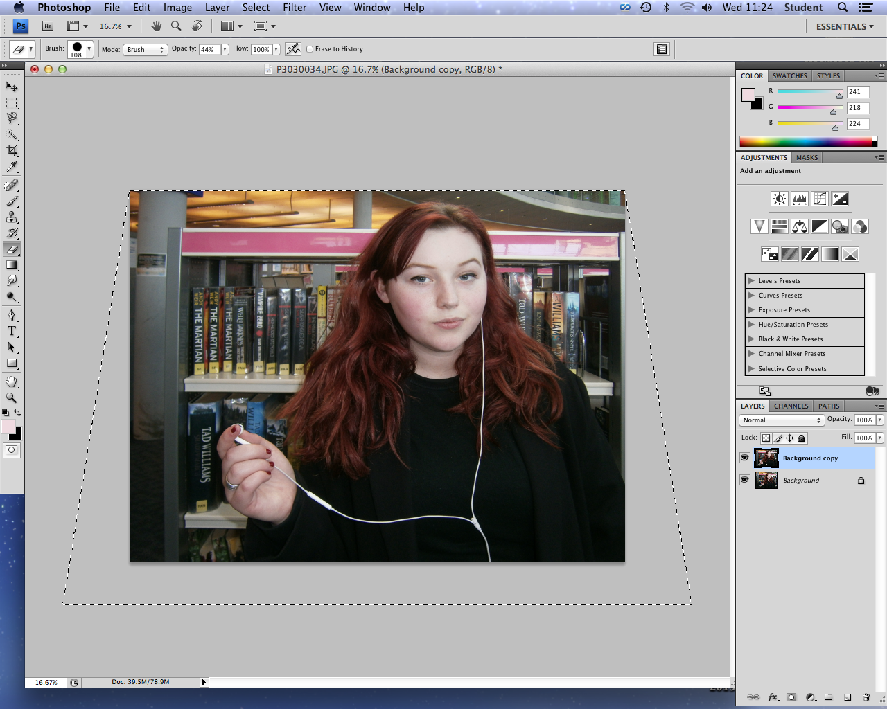
As I stated in my photography post that I would edit my two best images to test which is most appropriate for the listings magazine background, I began editing this image using Photoshop to blur and straighten the background to overlay, and enhance my model.
However, I decided that the background of this image was in fact too busy in comparison to the sophisticated, simple backgrounds within the Radio Times listing magazine (my exhibitor). Although I had planned to draw the attention of young people with this boldly colourful background, and introduce the main library location of my documentary, I felt that my second image was more appropriate for reflecting the seriousness of my documentary, and for overlaying text clearly. Therefore considering the time scale and my inexperience with using Photoshop, I decided to use Picmonaey to edit my image and create my listings magazine, due to my accessibility and familiarity with this software, allowing me to use it to its greatest effect and produce a better product.
![]() |
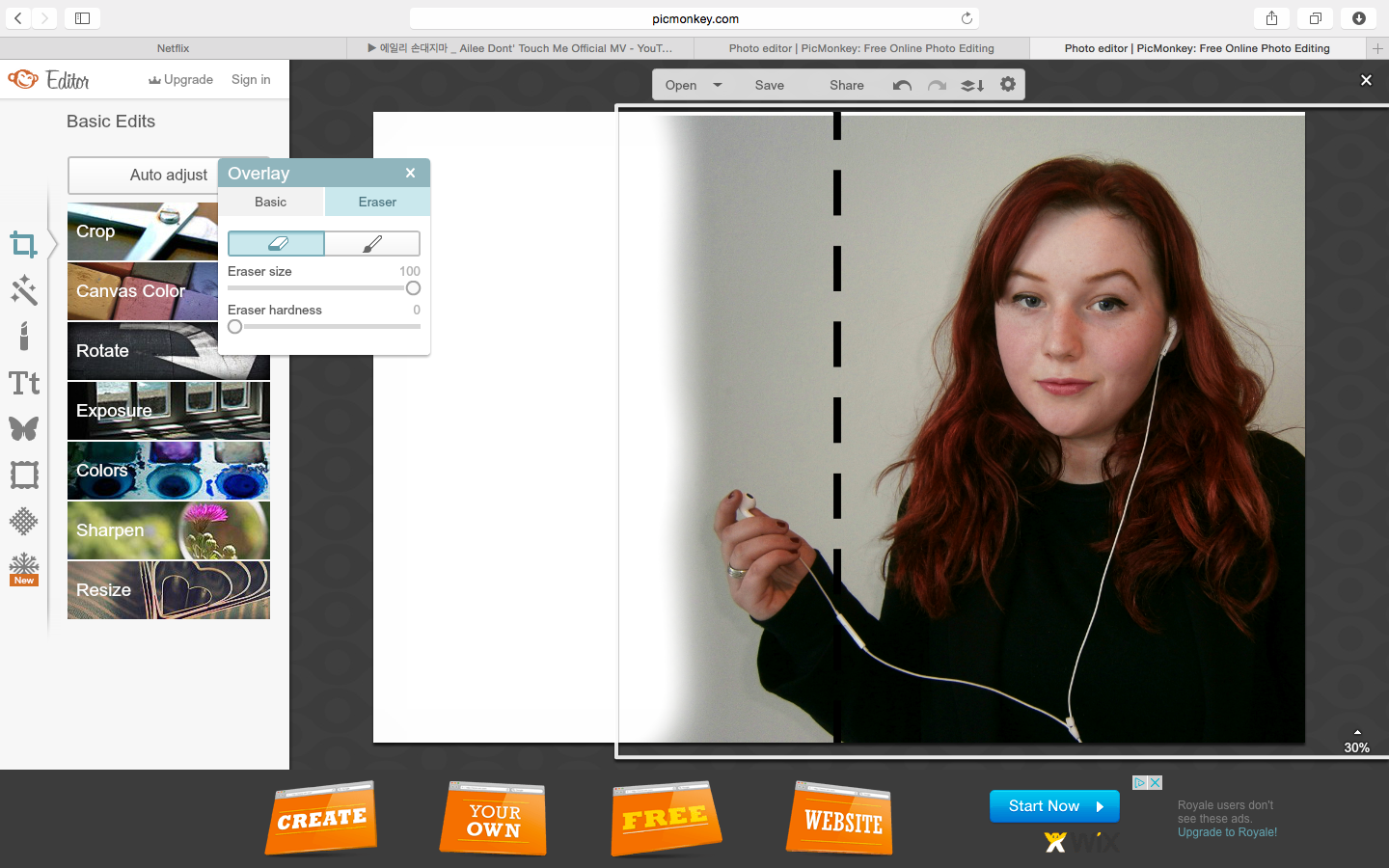
| Straightening my image to create an aesthetically pleasing, professional straight background with the bookshelf. |
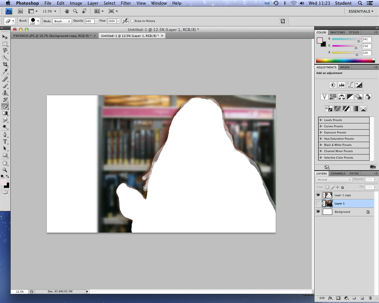
![]() |
| Finished blurred image background. |
However, I decided that the background of this image was in fact too busy in comparison to the sophisticated, simple backgrounds within the Radio Times listing magazine (my exhibitor). Although I had planned to draw the attention of young people with this boldly colourful background, and introduce the main library location of my documentary, I felt that my second image was more appropriate for reflecting the seriousness of my documentary, and for overlaying text clearly. Therefore considering the time scale and my inexperience with using Photoshop, I decided to use Picmonaey to edit my image and create my listings magazine, due to my accessibility and familiarity with this software, allowing me to use it to its greatest effect and produce a better product.
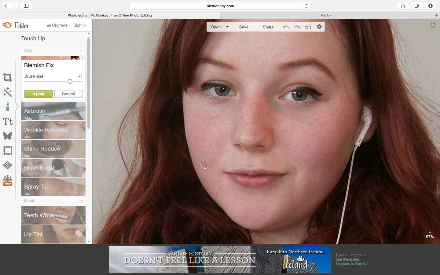
![]() |
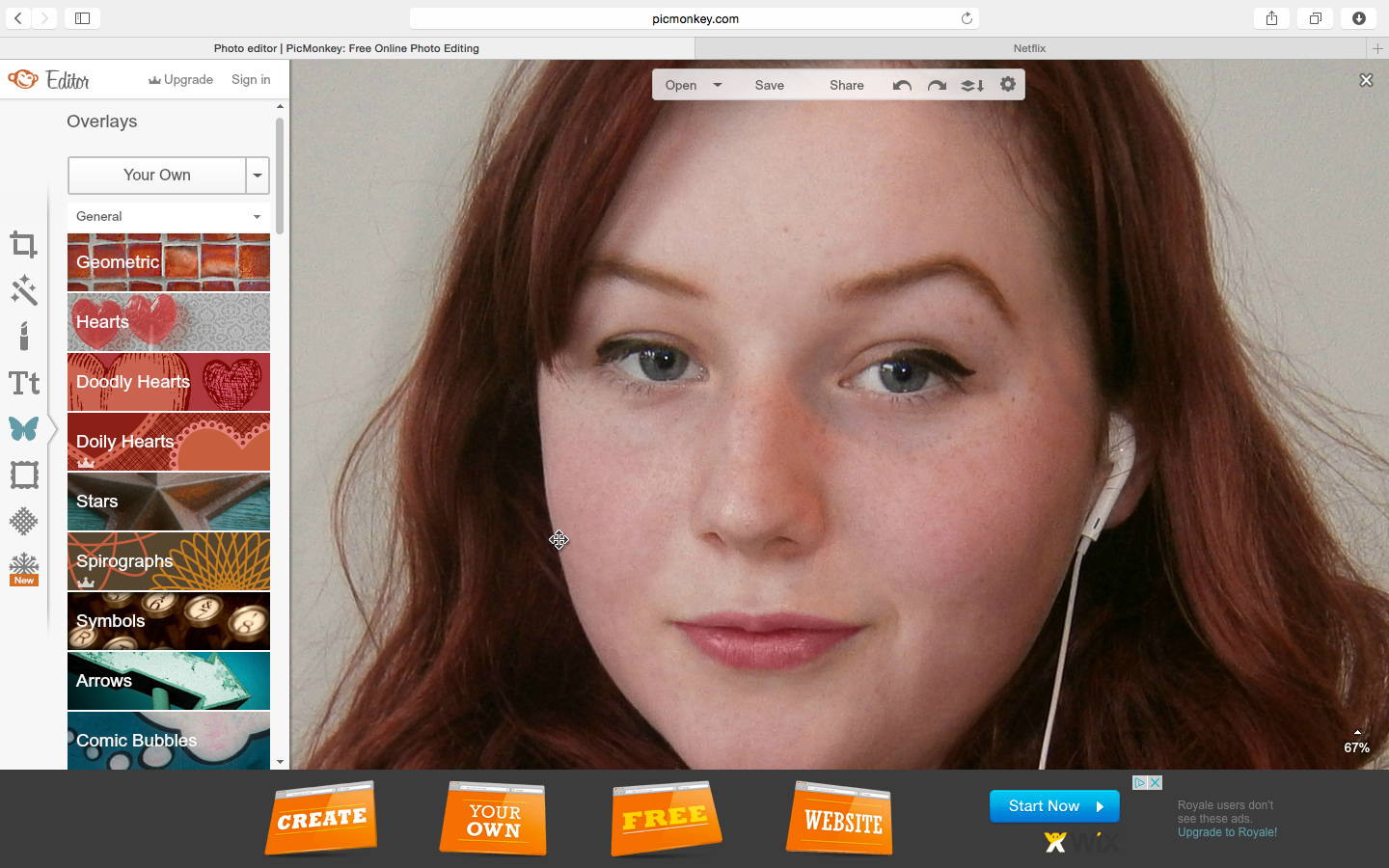
| I began by enhancing her skin using the blemish fix tool, as demonstrated by these before and after images. |
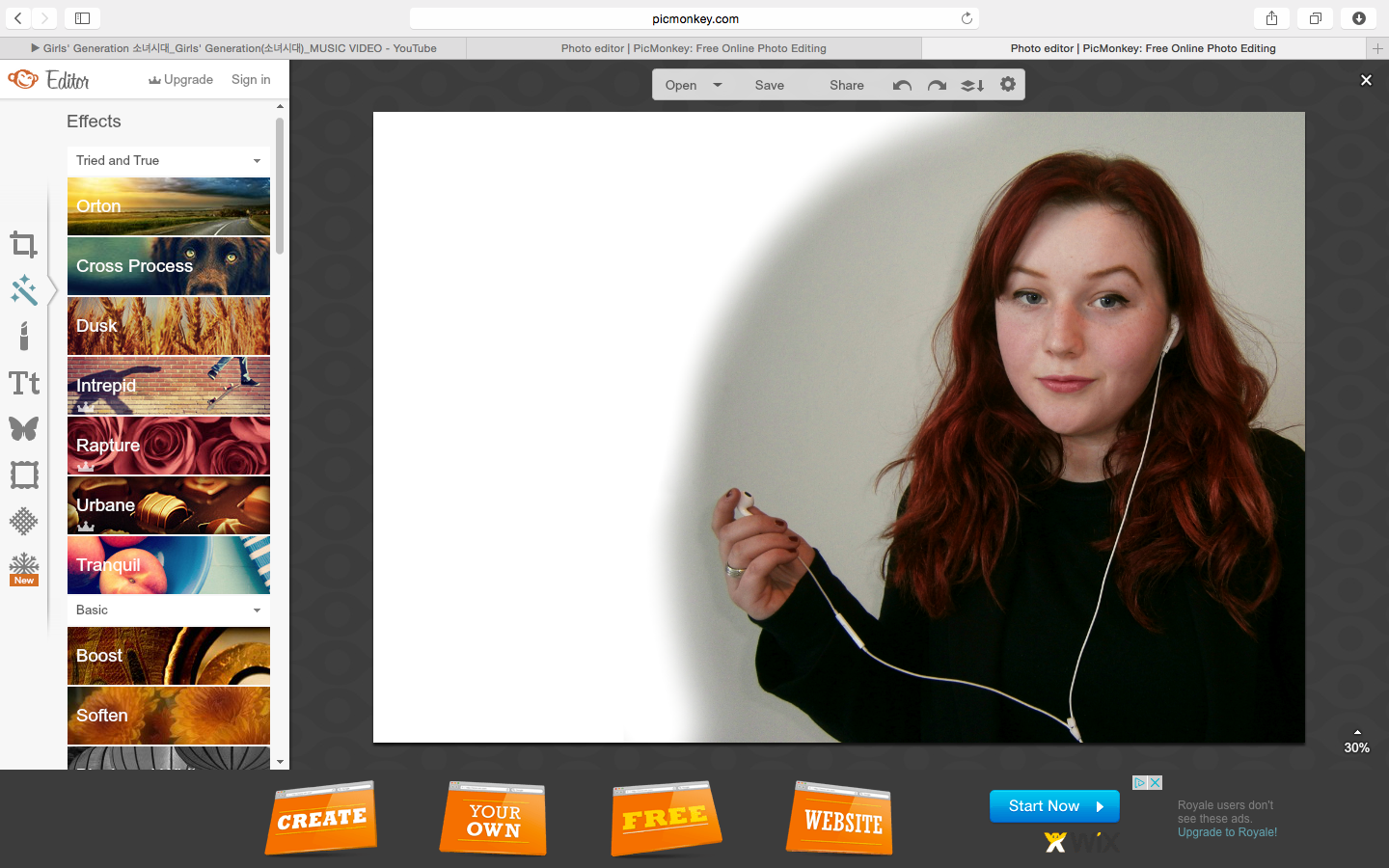
![]() |
| I also added subtle colour to her lips, creating a more bold, colourful and youthful image, relating to my younger demographic. |
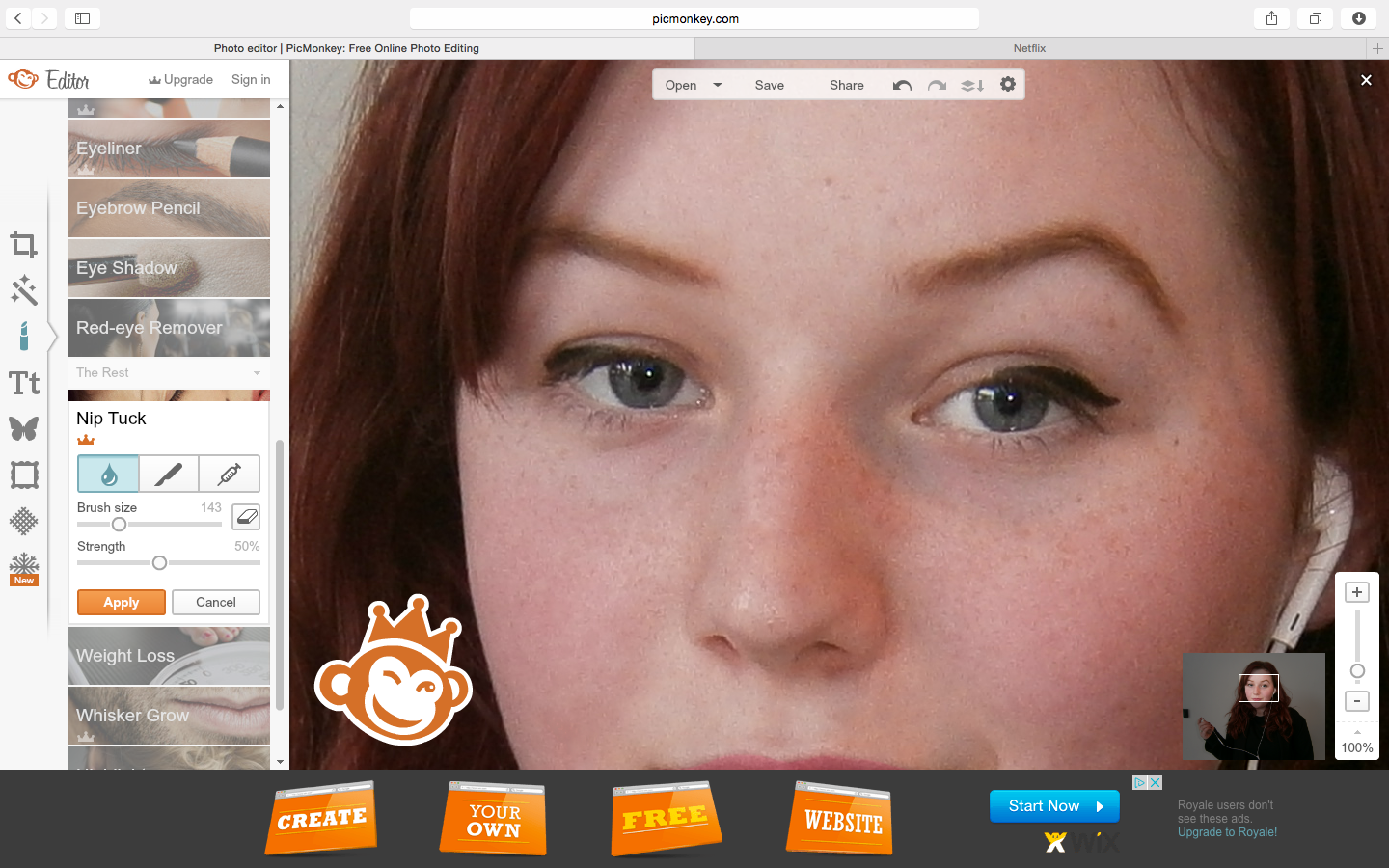
![]() |
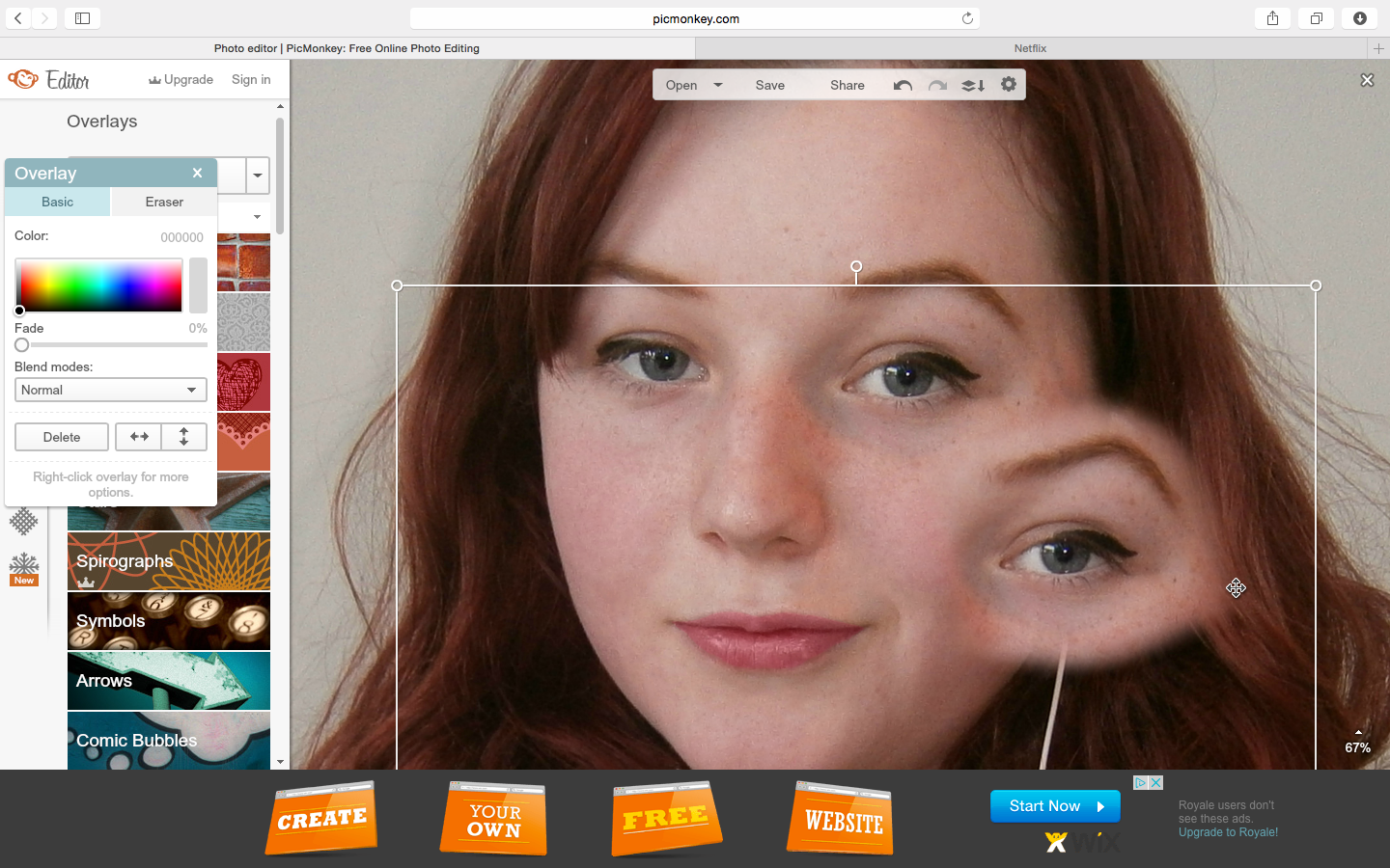
| Final raised eyebrow. |
![]() |
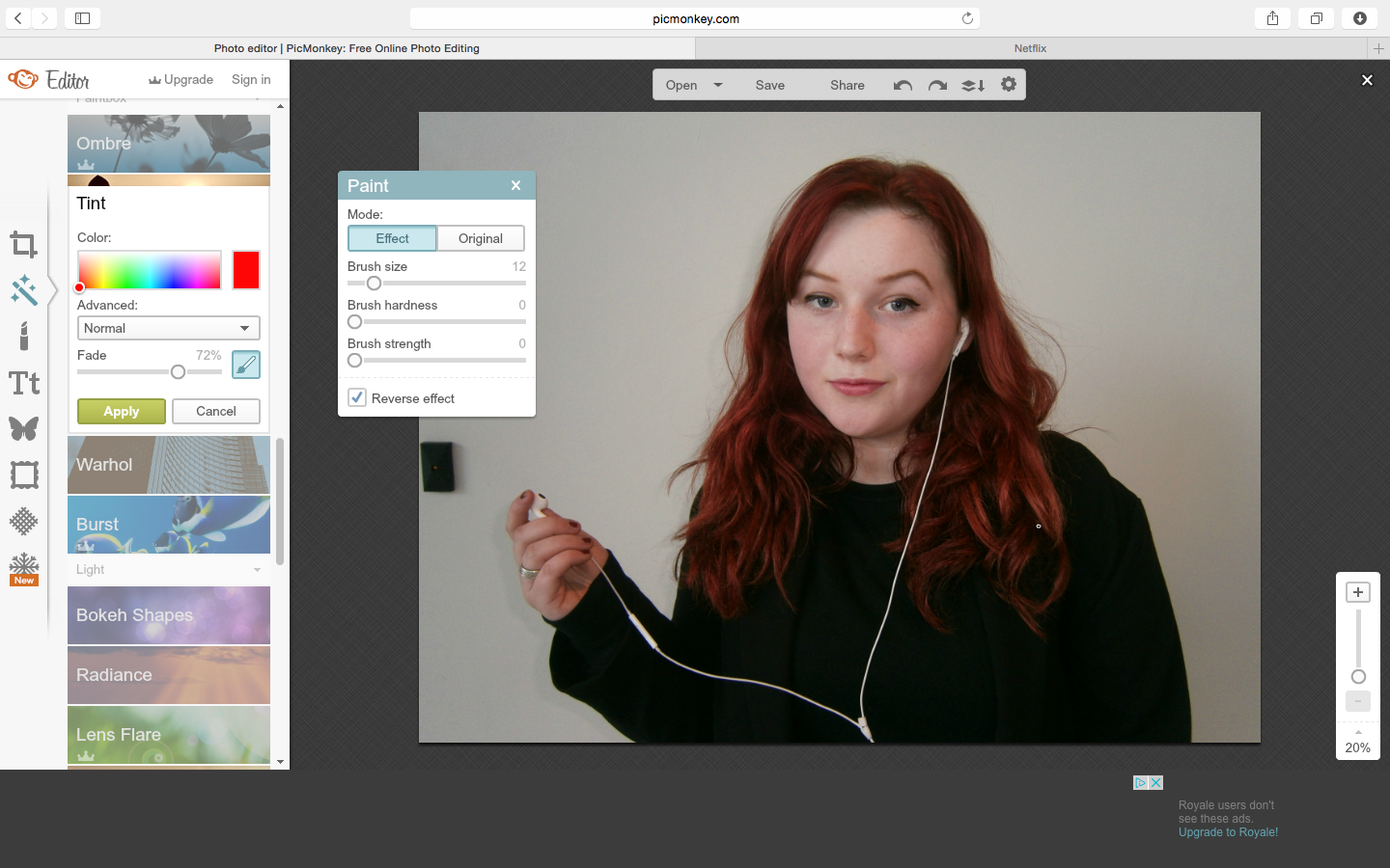
| To follow my plan of enhance her bold red hair against the soft, de-saturated background, creating a youthful and stylised look, I used the precisely painted over her hair with the red tint tool. |
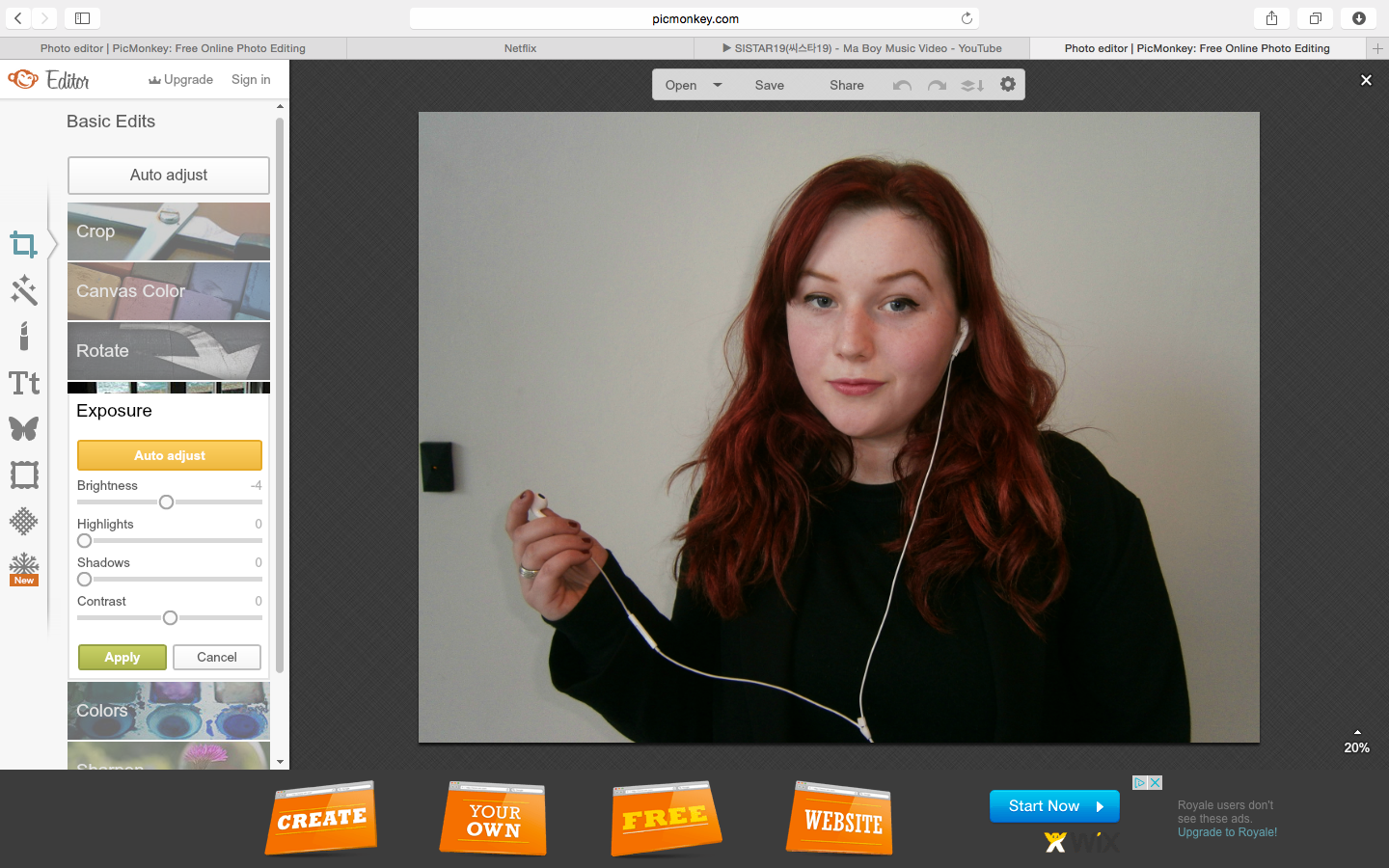
![]() |
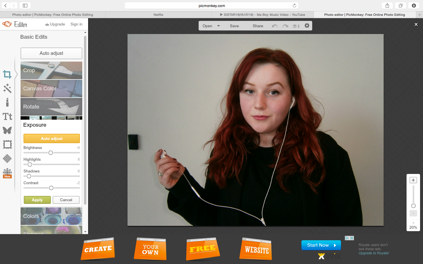
| I also enhanced the colours of this image through the highlights and shadow tools, bringing out the boldest colour of my colour scheme; red. |
Tuesday, 10 March 2015
Readability of my Products
To test the readability levels of my documentary narration and TV listings magazine article, to determine whether they are appropriate to the understanding of my 17-35 year old, educated and sophisticated target audience, and formal exhibitors, I used a Smog test.
Outcomes:
Documentary -
The SMOG index: 21.9
Total words: 266
Total number of polysyllabic words: 64
Total number of sentences: 11
TV listings magazine -
The SMOG index: 22.9
Total words: 234
Total number of polysyllabic words: 60
Total number of sentences: 9
From this test, this has shown me that my narration and article (with similar Smog test scores) are appropriate for my educated, formal and sophisticated target audience, as well as the formal readers of the Radio Times, and education seeking target audiences of the documentary genre. This is because they are above scores of 17; which is The Guardian and The Telegraph's Smog test scores, who's target readers are similarly formal and educated.
From the Readability Test article, I also found that darker colours are more difficult to read from, as well as white pages with black font for readers with dyslexia; which is why my TV listings magazine background is light grey with a simple, clear font.
![]() |
| Analysing the readability of a representative extract from my documentary narration. |
![]() |
| Readability of half of my TV listings magazine article. |
Outcomes:
Documentary -
The SMOG index: 21.9
Total words: 266
Total number of polysyllabic words: 64
Total number of sentences: 11
TV listings magazine -
The SMOG index: 22.9
Total words: 234
Total number of polysyllabic words: 60
Total number of sentences: 9
From this test, this has shown me that my narration and article (with similar Smog test scores) are appropriate for my educated, formal and sophisticated target audience, as well as the formal readers of the Radio Times, and education seeking target audiences of the documentary genre. This is because they are above scores of 17; which is The Guardian and The Telegraph's Smog test scores, who's target readers are similarly formal and educated.
![]() |
| Educated, formal/ upper-class/ high socio-economic, ABC1, and older reader profile for The Guardian - forming a Smog indication of my own target audience. |
From the Readability Test article, I also found that darker colours are more difficult to read from, as well as white pages with black font for readers with dyslexia; which is why my TV listings magazine background is light grey with a simple, clear font.
Friday, 6 March 2015
Audience and Exhibition
Using the YouGov website, I researched and analysed the main consumers of my exhibitors in relation to my target audience and productions to determine that they are appropriate and relevant. I have presented this research below using SlideShare.
Tuesday, 3 March 2015
Ancillary Product Photography
Following my plan for my photography, I styled and photographed my documentary presenter, Rowan, for my TV listings magazine double page spread photography in the style of the Radio Times (my exhibitor). To prepare this shoot, I brought my make-up kit and borrowed a still camera from my media department to ensure that my image is high quality, as it will fill most of an A3 page being a Radio Times style, double page spread background. As I photographed in my trademark Forum library location to present the setting of the majority of my documentary, I used the same clear natural lighting for this shoot.
Overall, I've decided that these two photos are the most professional looking and appropriate for my intended style, audience and exhibitor; therefore I will apply them to my draft to test which is most effective:
Below, I have evaluated my images in order to determine which is most appropriate for my double page spread.
- Poor lighting with an unnatural orange tint whilst I was figuring out the flash on the camera.
- Rowan's expression isn't very bold or interesting - too relaxed.
- The headphone is too far away from her head, preventing an aesthetically pleasing focal point.
- The headphones wire is looped.
- The shadow of the background draws focus to Rowan, creating an aesthetically pleasing balance.
- Rowan's facial expression is more interesting and dynamic than the previous image, with her wider eyes and slight smile.
- Although the smile makes the photo less serious, it presents the youthful style of my documentary.
- Same issue with the looped headphone, although this could be cropped.
- Her hand it raised higher to draw a focal point.
- Effective balance of shadows similar to previous image - however I don't want to focus on this area too much as I can edit this using Photoshop or Picmonkey.
- Her expression seems unnatural and draws attention away from the seriousness of the issue, due to her wider smile and lower 'concernedly raised' eyebrow.
- This is one of my two favourite expressions of Rowan's, as it captures the critical, serious, but playfully youthful look I am creating to represent the style of my product, and links to the photography within the Radio Times due to the similar expressions which I've deconstructed.
- The lighting is very clear and high quality, with an effective shadow balance for the background, however the exposure of her face may be too high; which I will need to lower during editing.
- The pink within the background relates to my topic of feminism, which presents my article content and the theme of my documentary.
- The colour balance is warm, bright and youthful due to the red, pink and orange which markets to my younger demographic and presents an eye-catching look, whilst her black costume aligns with the sophisticated, muted and monochromatic style of the Radio Times' photography.
- The tones of grey along the outside of the image can be selected to form my planned, fading left, gradient, soft grey to blurred bookshelf background.
- The plug socket on the wall can be edited out easily.
- The clean, clear background also naturally forms this soft grey gradient, fade, which is conventional to the style of the Radio Times.
- The lighting is very clear and balanced, although her red hair is washed out by the white background - however I can edit this to enhance the boldness of this colour.
- The colour scheme is muted, sophisticated and monochromatic which is conventional to the Radio Times, and also features the bold pop of red from Rowan's hair to add an expressive, youthful and interesting style.
- Her expression is quite bold and interesting, and is my second favourite expression overall due to the captured youthful and concerned style, despite her lower eyebrow.
- Her position to the side and the high slightly high angle forms a flattering and professional look.
- The headphone wire contrasts well with her black costume, follows the contours of her pose, and blends with the white background.
- Her position facing directly forward is less interesting and stylistic than my other images, or the photography in the Radio Times.
- Her expression is less interesting than some other images due to the lower eyebrow which prevents my concerned and critical envisioned look.
Overall, I've decided that these two photos are the most professional looking and appropriate for my intended style, audience and exhibitor; therefore I will apply them to my draft to test which is most effective:
Subscribe to:
Posts (Atom)