Showing posts with label semiotics. Show all posts

Sunday, 22 March 2015

Final Newspaper Advertisement

I have edited my newspaper advertisement using PicMonkey to;
  • crop to the proportions of 'i' landscape advertisements
  • adjust the rotation of the image, making the bookshelf lines straight and therefore aesthetically pleasing
  • enhance Rowan's features and hair using the blemish tool, lip tint, smooth to remove shine, and the red tint to enhance and brighten the colour of her hair
  • contrast, brightness, shadows, highlights and saturation to enhance the colours of the image
  • use the black and white effect which I erased over Rowan to de-saturate the background, drawing more attention to Rowan as the focal point, and then use on an additional layer to remove the yellow tones from the bookshelf
  • soften the background to make it less in focus, drawing attention to Rowan and following the conventional style of 'i' newspaper advertisements, as found within my deconstruction post

I then discovered from researching Channel 4's advertisements online, that the institution represents brand identity through a specific layout, font and use of text boxes; which is instructed within the Channel 4 style guide. I used this as a guide for formatting my advertisement.

One of the things I found was that Channel 4 have their own specific font named 'C4 condensed' for all promotions and off-air usage, which can only be used through Open Type. I researched how to use/ download this software, but as it had to be purchased, I screenshotted the font examples from the guide, and cropped the letters I needed on Microsoft Word in order to follow the conventional, strict layout of the brand I'm representing.
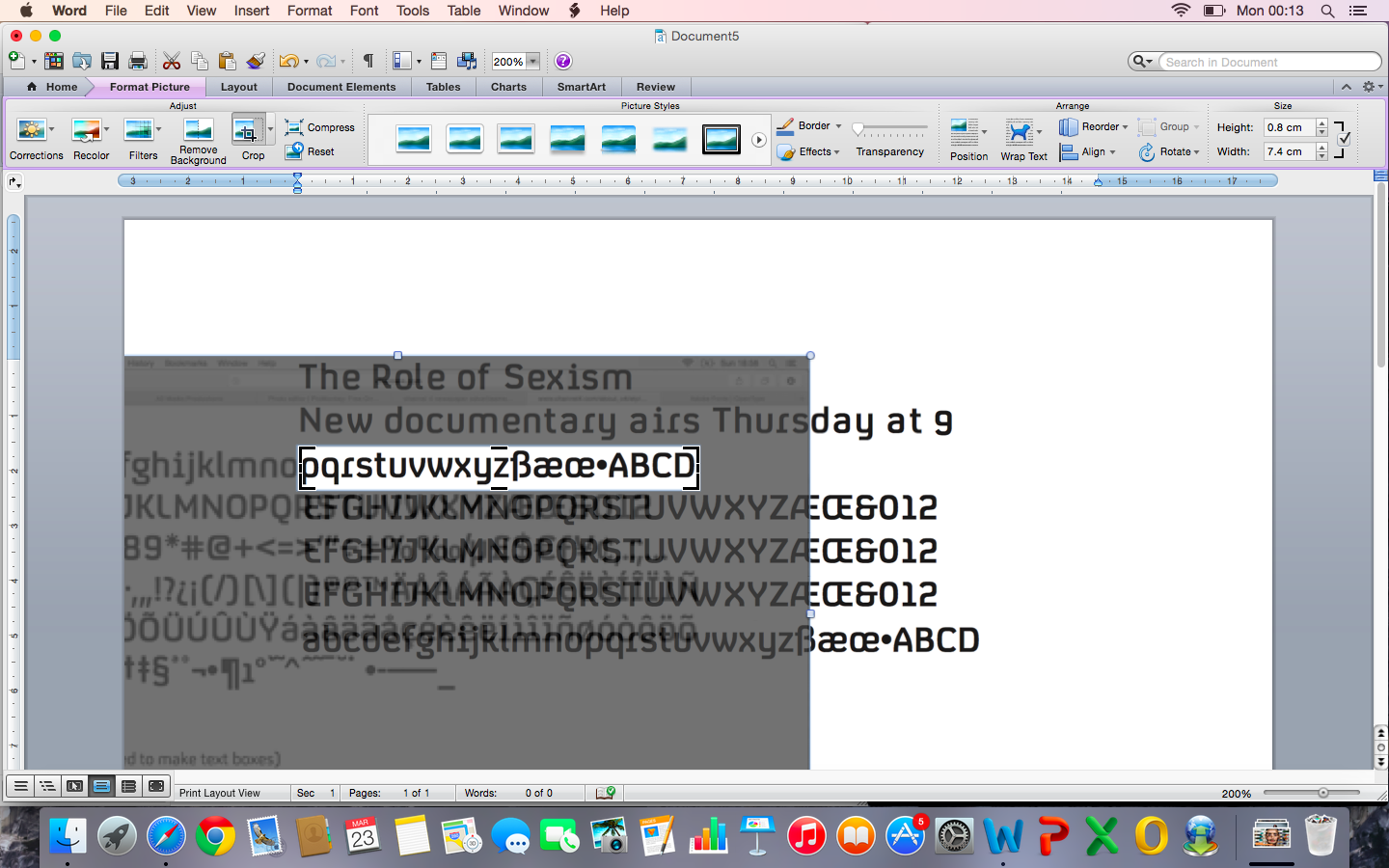
The title and subtitle also follow Channel 4's conventions as all print advertisements include the programme's main title, and scheduling information for the subtitle, as found from my research into genre and the guide. I then screenshotted these and added them to a new document over my background image - which I measured as 25.9mm (w) x 15.5mm (h) to suit my exhibitor's format. I cropped around their white background to form the Channel 4 textboxes, and positioned them conventionally against the lower left edge of my background.

The Channel 4 logo was also guided to be placed 10mm (in relation to my advertisement dimensions) from the centre of the right edge of my background. I downloaded and overlaid the conventionally white logo, and adjusted the height with Microsoft Word's ruler to 5.2cm, as its height = the heigh of my advertisement x 0.333 according to the guide.

Finally, following Channel 4's guided conventions, I added a short url of the proposed webpage for my documentary on the Channel 4 website, in the same simple, rounded, small font and position.

Above is a screenshot of the final version of my newspaper advertisement, which I will be printing due to its failure to upload to SlideShare, and in order to print the accurate dimensions. Overall, I feel that it is appropriately attractive to my younger demographic due to the vibrant, artistic colour scheme, which is appropriate for my 'i' exhibitor, and also represents and creates an enigma for my documentary through the semiotic of the music industry with my headphone mise en scene, and educated/ information with the bookshelf. This use of interpretative semiotics is also conventional to Channel 4 newspaper advertisements, which links my ancillary product to my documentary exhibitor. The costume, model, setting and style of photography also links to my listings magazine and documentary effectively, forming relating, supportive products. Finally, I have met my conventions of formatting with great detail from following the Channel 4 style guide throughout my editing, resolving the issue of fonts by individual cropping them, and from deconstructing the 'i' newspaper in this post.

Tuesday, 30 December 2014

Costume, Mise En Scene and Semiotics

Below is my Prezi demonstrating my research, planning and organisation for the costume and mise en scene (including the semiotic representations which they create) that I'll be using within my documentary and ancillary product photography.


To research in greater detail about semiotics, I used these resources;
http://www.uvm.edu/~tstreete/semiotics_and_ads/terminology.html


I've also created a concept board for my costumes using Polyvore, which I have based on my Prezi presentation for this area. Polyvore was very helpful for creating this concept board as it links to where the costumes can be purchased, which I'll use for organisation of costumes and to include more detail about them on their original websites. My narrator's costume is to the left of the collage, and my interviewee's is towards the right.
Media Studies Costume


Next, I'll send these costumes to my cast to organise which similar clothing items they own themselves and which I'll need to arrange in their sizes.

*Update: After casting, I've sent this concept board to Rowan and Emily to arrange their costumes. The ones which they own match perfectly to my envisioned style as set out by my concept board, therefore they will wear these to each shoot, with Rowan varying between jeans and black trousers to create a slightly more interesting range and to differentiate between time during my shoots.*