Sunday, 22 March 2015

Plan and Deconstructions of Newspaper Advertisements

Within the SlideShare presentation below, I have deconstructed four newspaper advertisements from my exhibitor for this ancillary product, 'i', and made comparisons between these. This has allowed me to understand the layout, format and styles of newspaper advertisements within my exhibitor, and plan my ancillary product appropriately.

Newspaper Deconstruction from Courtney O'Donnell

From this, I will begin to design and make my newspaper advertisement ancillary product, whilst referring to this research and plan.

Saturday, 21 March 2015

Final TV Listings Magazine

I used PicMonkey to edit my image and create my background, and then formatted this into the TV listings magazine double page spread using Microsoft Word, due to its precise measurement ruler to accurate follow the Radio Times house style, and more professional text editing tools than PicMonkey.
The basic, limited text editing and formatting options with using PicMonkey.

Editing the width and height of my image in cm's using Word to the exact measurements of a Radio Times double page spread (which I previously measured from my copy).

Using the Tabloid Oversize option for my page layout to accurately follow the Radio Time's format and avoid my double page being cropped when printed.

Adding the divided halves of my article using the justified text layout and Times New Roman 9pt following the conventional layout of the Radio Times that I analysed. Following these conventions, I also added the oversized first letter using the closest font to the Radio Times' from testing a range, and used the shift key to align my text neatly around this following another convention.

I felt that my article was looking too fragmented due to my short paragraphs alongside the justified text layout, therefore I grouped them together to make them more organised and conventional to the Radio Times.


Distributing my text evenly so that the halves of my article lined up neatly and conventionally to the Radio Times. I also used the capitalised, larger, bold, Arial font for my writer's name, following the conventions of Radio Times to separate this from the article, and the page numbers in the two bottom corners in line with the article and in the same position as the Radio Times'. I used the same page number as Channel 4's documentary article within this magazine, as it roughly demonstrates where double page spreads about documentaries by my exhibitor are discussed.

I added the conventional fine, black line dividing the page numbers and the article, and cropped this at my image to look professional and aesthetically pleasing.


Adding my title similarly to the Jon Snow Radio Times article (which is the main inspiration for my double page spread), through using a quotation from within the article, the closest font, and larger, bolded key words to attract my readers and present the main focus of my documentary. I also used the shift key to stylistically layout my lines similarly to that article, and to create a professional, interesting and artistic look which would relate to my young audience.

Adding my article subtitle and my quotation on the right page using red font to create a youthful house style which is aesthetically pleasing due to Rowan's red hair. Placing my quotation from Rowan over her image also links the two together without stating her name, and immediately introduces her views before reading the less eye-catching article.

Adding the conventional Radio Times programming information and dividing line, using the appropriate fonts, sizes and styles for each separated piece of information, which I had to test.


Looking at the article from a distance, I decided that the position of my quotation had too much negative space below, and blended to similarly to my title, which uses the same font. Therefore I changed its colour to white, allowing me to layer this over Rowan's hair for a more centred layout. This also makes the quotation a focus point of the right page after Rowan's face, which engages my readers immediately. Whilst I was trying to draw in my younger audience with the bright, youthful colours, I feel that this looks more sophisticated and professional, and the article itself which includes a focus on young people, as well as my young, colourful model will do this effectively.

Adding my catchy image caption, which is conventional to the Radio Times, using the same font styles.

The final stage of editing for my TV listings magazine double page spread was adding my photography credits in the same position, capitalised font and single description of the photographer's name as the Radio Times.

Overall, I am happy with the professionalism, sophistication and artistic style of this ancillary product, achieved by my conventional, stylistic format to the Radio Times, as well as my youthful and bold photography. The article effectively creates an enigma for my documentary by introducing its theme, relevance to contemporary society and modern culture, features such as interviews and deconstructions, and purpose to investigate sexism within the media, which are conventional aspects to present and advertise programmes within the Radio Times. Furthermore, I feel that I have engaged my audience and readers effectively through my interview with Rowan and descriptions of her as an innovative young presenter; not only creating a connection between the reader and my presenter through this focus, but also engaging young people and justifying my young model, which some older readers may be surprised to see alongside the older adults within this TV listings magazine. Finally, I have included detailed information of when my documentary is scheduled (which is the main purpose of this ancillary product), and accurately met the conventions for my genre and exhibitor.

As my ancillary product was formatted especially to be printed, and because I cannot upload this as a Word document on SlideShare etc. due to my unsupported layout, I will submit this as a printed hard copy. However, below I have added a screenshot of the final version.

The main inspiration for this ancillary product, as analysed in my screenshots:
Article on Jon Snow's Channel 4 documentary within the Radio Times.

Friday, 20 March 2015

Cultural Codes and Scheduling

To research the cultural codes of my exhibitor, Channel 4's documentaries, and how they effectively reach their target audience through character representations and scheduling, I have analysed the cultural codes of documentaries from the Channel 4 website. This has allowed me to understand how I can reach my target audience through time and date airing of my documentary, which I can include within my ancillary product information. I have presented this research below using SlideShare.

Thursday, 19 March 2015

Copyright and Permissions

As I am using archive footage and outsourcing my music by hiring a musician/ composer (Maya Law), I have researched the copyright issues that I may face.

http://www.desktop-documentaries.com/do-i-need-permission-to-use-file-footage-and-other-video-material.html
From this website, I found that archive footage is only legal if it is royalty free; however I visited the royalty free archive footage website and was unable to find any of my videos. Another article by this website suggested that I would need to get permission for the footage from the producers, just as I had from my musician to make it legal. As the main producer of my archive footage is a multi-national media conglomerate, Universal Music Group, it is clear that they would not be available to discuss copyright for my A level. Therefore, my next step was to investigate UK Fair Use laws, as the article suggested.

http://www.copyrightservice.co.uk/copyright/p09_fair_use
Fair Use is the idea that if copyright laws are too restrictive, it may stifle free speech, news reporting, or result in disproportionate penalties for inconsequential or accidental inclusion. Therefore they allow certain content to be legally used for these reasons. From researching the conditions, I found that it would be legal for me to use my archive footage as it falls under the following;
  • the quoted material is justified by my narration, and no more than necessary is included
  • I will mention the source of my quoted material, along with the name of the author (artist and production studio)
  • it is used for the purpose of news reporting and education, as this is the purpose of the documentary genre
  • it falls under education use as my A level coursework
This has resolved my concerns with copyrighted footage, therefore from this point I will add the credits to my archive footage to ensure that it is legal.

Finally, for shooting within my public setting, I spoke to the assistant manager of the Forum library on her floor to describe my production, and receive spoken permission to shoot within this location.

Adding Statistics to my Documentary

After showing my documentary to my teacher for feedback, it was recommended that I added statistics about sexism within the media to make my documentary more informative and visually stimulating.

Therefore I referred back to my research of this and found a useful statistic about female production roles within the film and TV industries which is appropriate to overlay for Mr Mooney's interview which is quite visually bare, and discusses this exact topic, allowing me to enhance this discussion. Furthermore, this information from a reliable source increases his credibility as an expert interviewee. However as the statistic is outdated (2012), I revisited the website http://www.wftv.org.uk/resources/reports-and-statistics for an updated version.

"In 2013-14, women comprised 26% of all directors, writers, producers, executive producers, editors, and cinematographers. This is even with the figure from 2011-12 and up 2 percentage points from 24% in 2008-09." - Martha Laurzen, 'Independent Women'

"Fewer than 9% of the UK’s film directors are female." - Melody Bridges, 'Why Aren't There More Women Director's In The UK Film And TV Industry?', Women in Film and Television UK

I also found information which is also relevant to the UK, and relates to the next steps for equality of production roles which Mr Mooney discussed;
"Directors UK have published a report that sets out recommendations for production companies and broadcasters to increase the employment of women directors in UK television production.  The ambition is to work with production companies and broadcasters so that in 2017 women are directing 30% of all original programmes broadcast."

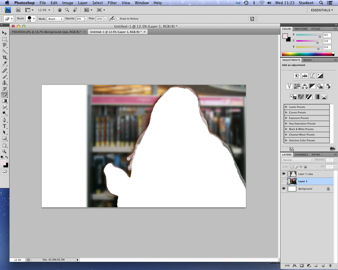
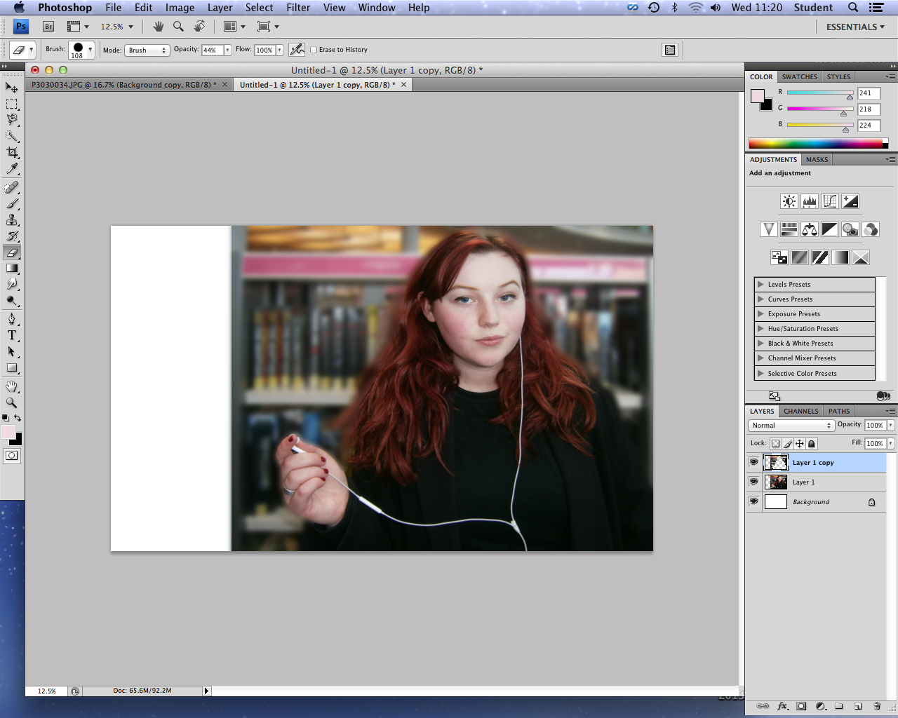
I will be using all of these statistics within the final section of my documentary, but make them shorter so that they are more concise to read. Furthermore, to emphasise Rowan's definitions of sexism and misogyny, allowing a firm knowledge of these key terms to understand my documentary for my audience, I'm adding their definitions in text. This also repairs the issue of jumping between clips where I had to split the shot between two takes, effecting the footage but not the audio.

Sexism: Prejudice, stereotyping, or discrimination, typically against women, on the basis of sex.
Misogyny: Dislike of, contempt for, or ingrained prejudice against women.
- Oxford Dictionary

Thursday, 12 March 2015

Evaluation

I've began writing my evaluation of my A2 portfolio and productions. Here is a link to my Wix account, where I will be posting my evaluation: courtneyodonnell97.wix.com/a2evaluation

Wednesday, 11 March 2015

Creating my Listings Magazine - Background

As I stated in my photography post that I would edit my two best images to test which is most appropriate for the listings magazine background, I began editing this image using Photoshop to blur and straighten the background to overlay, and enhance my model.
Straightening my image to create an aesthetically pleasing, professional straight background with the bookshelf.

Adding my image to a larger canvas representing my double page spread, and adding a blur to form the blurred gradient grey background. I erased this blur around my model in order to make her the focal point.

Finished blurred image background.

However, I decided that the background of this image was in fact too busy in comparison to the sophisticated, simple backgrounds within the Radio Times listing magazine (my exhibitor). Although I had planned to draw the attention of young people with this boldly colourful background, and introduce the main library location of my documentary, I felt that my second image was more appropriate for reflecting the seriousness of my documentary, and for overlaying text clearly. Therefore considering the time scale and my inexperience with using Photoshop, I decided to use Picmonaey to edit my image and create my listings magazine, due to my accessibility and familiarity with this software, allowing me to use it to its greatest effect and produce a better product.

I began by enhancing her skin using the blemish fix tool, as demonstrated by these before and after images.


I also added subtle colour to her lips, creating a more bold, colourful and youthful image, relating to my younger demographic.
One of my issues with this image was the fact that her expression was one which was less critical of the media, as my directions were to have a raised eyebrow to demonstrate the theme of the documentary through this symbol alongside the headphones - as by holding one of the headphones away from her ear, this suggests that my presenter has something to criticise about the music industry and media in general. Therefore I used the distort tool to edit a raised eyebrow.

However as this function wasn't accessible to me, I had to screenshot the image at 100% zoom, overlay the screenshot to the original image, erase around the eye/ eyebrow, resize, and add this over the original eyebrow, which was successful for solving this problem.

Final raised eyebrow.

To follow my plan of enhance her bold red hair against the soft, de-saturated background, creating a youthful and stylised look, I used the precisely painted over her hair with the red tint tool.

I also experimented with the exposure of the image, and decided to enhance the shadows by reducing brightness, to create a sophisticated, professional background similar to the Channel 4 double page spread within the Radio Times which I am basing my design on.

I also enhanced the colours of this image through the highlights and shadow tools, bringing out the boldest colour of my colour scheme; red.

After finishing my edits to the original image which will form the background of my double page spread, I created a new design to create the listings magazine over. I measured the dimensions of a double page of the Radio Times to fit to my exhibitor (w=44cm x h=29.8cm) and resized my canvas to these proportions, with the height as the height of my image to maintain its quality while I edit. I will scale the finished edit to exactly 44x29.8cm using Photoshop.

I then added my edited image as an overlay of this canvas to create the bases of the background. Following the layout of Channel 4's double page spread within the radio times, I aligned Rowan's head which is the focal point of my image within the centre of the right page (so that the text is read first on the left), with her headphone holding hand overlapping the left page to draw attention to this mise en scene as it is broken away from the page (similarly to the Channel 4 article image which draws focus to the drugs John Snow is holding). I added a line in the centre of the canvas to divide the two pages precisely whilst I align my image.

I then erased the excess background of the image with soft edges to blend the backgrounds, and in a curve following her body to form an artistic shadow due to the darker shades which will contrast with my grey canvas background.

To select a shade of grey which blends with the image background, I used the colour picker tool for changing text colour and copied this colour html code. I then proceeded to blur the edges of the image and background using the soften paint tool, and added a frosted edge precisely using the paint tool to create my planned gradient, shadowed effect - with the lighter background on the left page so that my dark text can be clearly read.

After removing the colour test text and adding more frost to experiment with balancing the light, this is my finished background which I will proceed to add my article, tiles and layout text to (such as page numbers) as planned.

Tuesday, 10 March 2015

Readability of my Products

To test the readability levels of my documentary narration and TV listings magazine article, to determine whether they are appropriate to the understanding of my 17-35 year old, educated and sophisticated target audience, and formal exhibitors, I used a Smog test.
Analysing the readability of a representative extract from my documentary narration.

Readability of half of my TV listings magazine article.

Outcomes:
Documentary -
The SMOG index: 21.9
Total words: 266
Total number of polysyllabic words: 64
Total number of sentences: 11

TV listings magazine -
The SMOG index: 22.9
Total words: 234
Total number of polysyllabic words: 60
Total number of sentences: 9

From this test, this has shown me that my narration and article (with similar Smog test scores) are appropriate for my educated, formal and sophisticated target audience, as well as the formal readers of the Radio Times, and education seeking target audiences of the documentary genre. This is because they are above scores of 17; which is The Guardian and The Telegraph's Smog test scores, who's target readers are similarly formal and educated.
Educated, formal/ upper-class/ high socio-economic, ABC1, and older reader profile for The Guardian - forming a Smog indication of my own target audience.

From the Readability Test article, I also found that darker colours are more difficult to read from, as well as white pages with black font for readers with dyslexia; which is why my TV listings magazine background is light grey with a simple, clear font.

Monday, 9 March 2015

Typography and Titles

I have planned and presented the specification for the house style fonts of all of my ancillary products below using Exam Time.
Mind Map created by courtneyodonnell with ExamTime

Following this plan, I experimented with a variety of Final Cut Pro fonts, and found a thin, elegant and sophisticated font which is most appropriate for my documentary due to its formality and modern, minimalistic, youthful look.
Italicised font to represent the quotation.

Experimenting with a balance of upper and lowercase letters to create my artistic, sophisticated and youthfully modern style which would appeal to both my younger demographic and sophisticated older demographic.

To plan my documentary titles (which will remain the same for my newspaper advertisement, and my listings magazine will include a quotation from the article, according to conventionalities of my products/ exhibitors), I researched current Channel 4 documentary titles in order to choose one which is appropriate for my exhibitor.

I found that these titles most commonly use simplistic language, keywords about the themes or topics of the documentaries, colloquial phrases to relate to their target audience, and are short and punchy (often two words) to create a lasting and memorable effect; such as 'Drugs Live', 'Food Unwrapped', Kids Who Can't Stay Awake', 'Being Bipolar' and 'One Born Every Minute'.

These are my evaluated ideas for titles;
  • 'Sexism and the Media' - unbiased by suggesting there's a relationship but not defining it, presents a debate, but sounds like 'Sex and the City', which is misleading.
  • 'Representing Gender' - ambiguous to create an enigma and present my theme. Gender rather than sexism as it would deter non-feminists (part of my target audience) but attract feminists (also my audience) - less of a balance. It contains two words similarly to Channel 4 and is simple, and also sophisticated to represent my style of documentary, but sounds quite boring - less interesting to potential audiences, unlike 'Blurred Lines: The Battle of the Sexes'.
  • 'Misogynistic Media' - too complicated and strong/ controversial, however the alliteration is persuasive.
  • 'Gender Roles in the Media' - pun of feminist idea of gender roles as well as roles within the media (production, actors, writers, musicians etc.) - represents my two topics. However this pun isn't very obvious and the title is lengthy - less punchy.
  • 'Our Sexist Media' - addresses the audience and engages them, however it sounds like I'm blaming my audience whereas my documentary blames institutions - contradiction.
  • 'Feminism vs. the Media' - appeals to feminists but audiences are often put off by feminism - taboo word which isolates them.
  • 'The Role of Sexism' - suggests that sexism is a major part of the media industry just like production roles - appropriately introduces my documentary without being too obvious. Simple, mono-syllabic and includes a pun (like gender roles) - conventional of my exhibitor.
Therefore in conclusion I have decided to choose 'The Role of Sexism' as my main title due to its appropriateness to both my documentary and my exhibitor, whilst not isolating non-feminists with controversial language, but attracting feminists interested in debates of sexism (my primary, active audience).

I also added a hashtag to my titles, following my main title in structure, in order to market to and engage with my younger audience more interactively through Twitter and Facebook debates and discussions. This would also advertise my documentary through the two-step-flow concept, as followers of social media accounts or users who notice the trend would become curious about the nature of the hashtag and discussions or become interested in the debate - therefore leading them to my production.

Sunday, 8 March 2015

Male Representation Footage

Following the identified for male representation within my documentary from my focus group, I have planned a short shoot within this Prezi presentation to resolve this issue below.