As I stated in my photography post that I would edit my two best images to test which is most appropriate for the listings magazine background, I began editing this image using Photoshop to blur and straighten the background to overlay, and enhance my model.
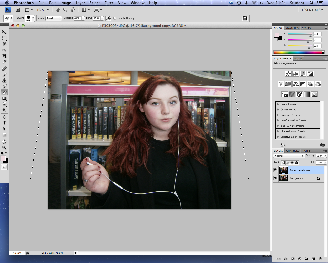 |
| Straightening my image to create an aesthetically pleasing, professional straight background with the bookshelf. |
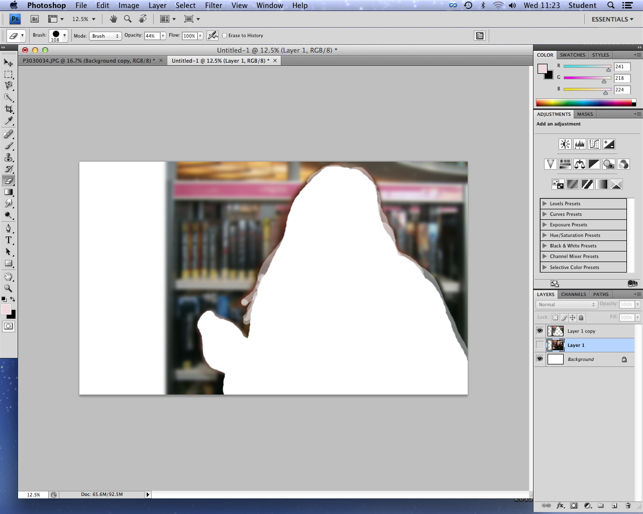 |
| Adding my image to a larger canvas representing my double page spread, and adding a blur to form the blurred gradient grey background. I erased this blur around my model in order to make her the focal point. |
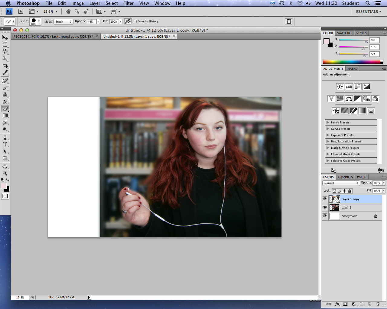 |
| Finished blurred image background. |
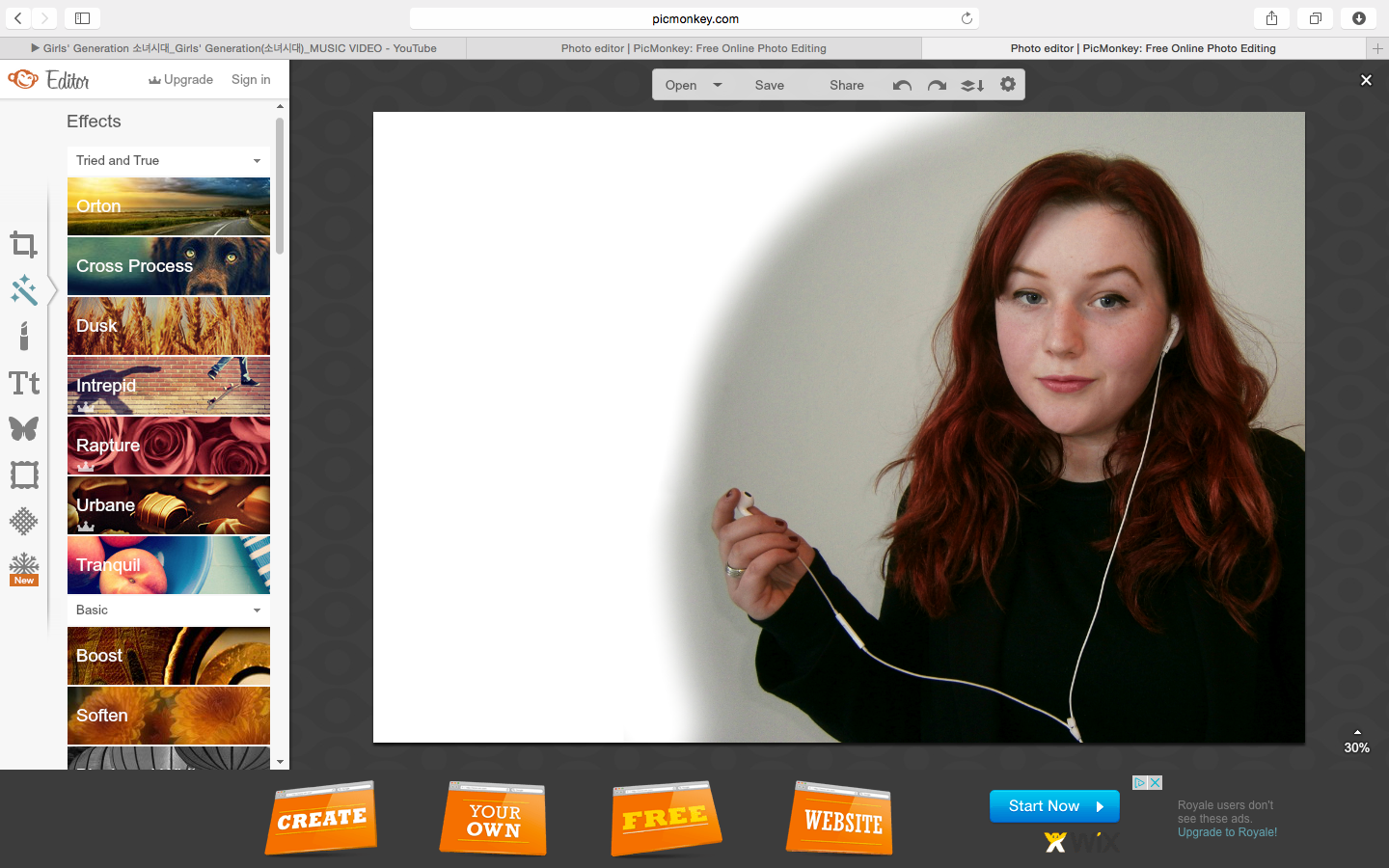
However, I decided that the background of this image was in fact too busy in comparison to the sophisticated, simple backgrounds within the Radio Times listing magazine (my exhibitor). Although I had planned to draw the attention of young people with this boldly colourful background, and introduce the main library location of my documentary, I felt that my second image was more appropriate for reflecting the seriousness of my documentary, and for overlaying text clearly. Therefore considering the time scale and my inexperience with using Photoshop, I decided to use Picmonaey to edit my image and create my listings magazine, due to my accessibility and familiarity with this software, allowing me to use it to its greatest effect and produce a better product.
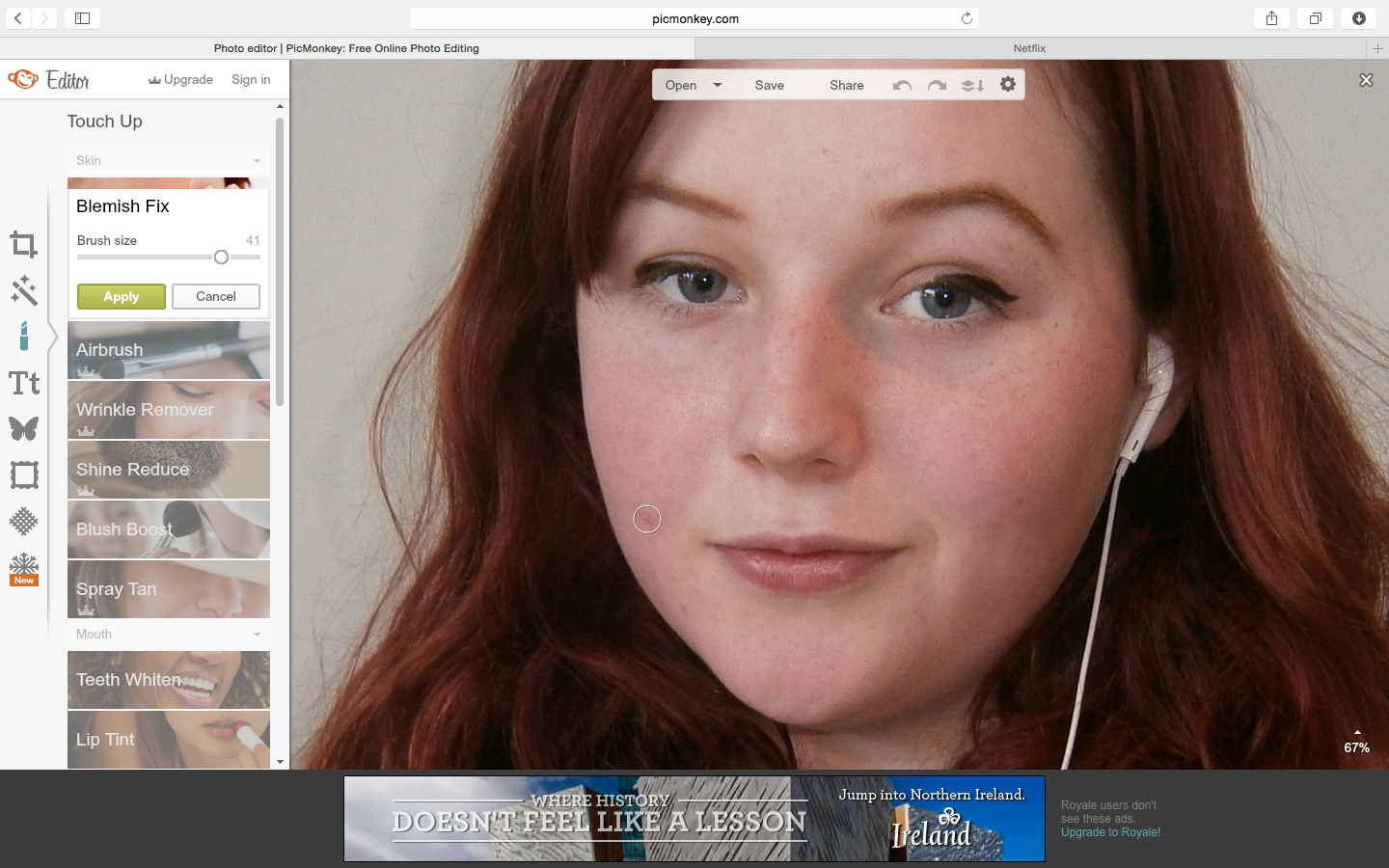 |
| I began by enhancing her skin using the blemish fix tool, as demonstrated by these before and after images. |
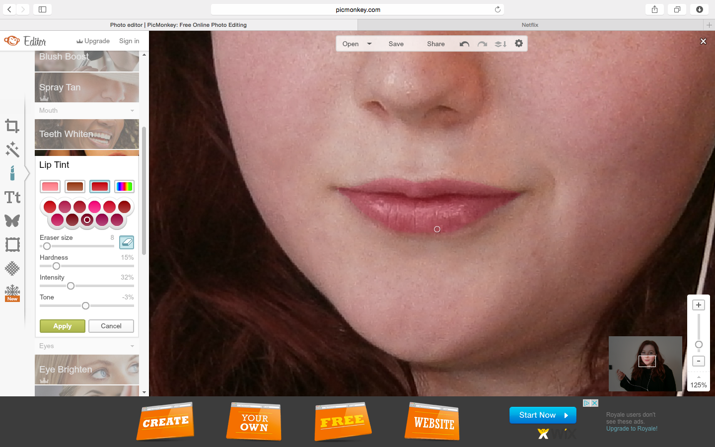 |
| I also added subtle colour to her lips, creating a more bold, colourful and youthful image, relating to my younger demographic. |
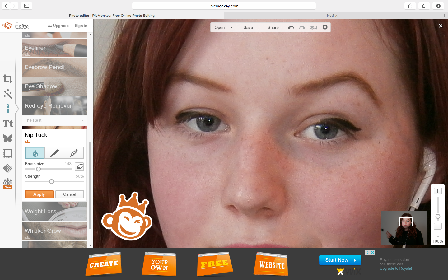 |
| One of my issues with this image was the fact that her expression was one which was less critical of the media, as my directions were to have a raised eyebrow to demonstrate the theme of the documentary through this symbol alongside the headphones - as by holding one of the headphones away from her ear, this suggests that my presenter has something to criticise about the music industry and media in general. Therefore I used the distort tool to edit a raised eyebrow. |
 |
| However as this function wasn't accessible to me, I had to screenshot the image at 100% zoom, overlay the screenshot to the original image, erase around the eye/ eyebrow, resize, and add this over the original eyebrow, which was successful for solving this problem. |
 |
| Final raised eyebrow. |
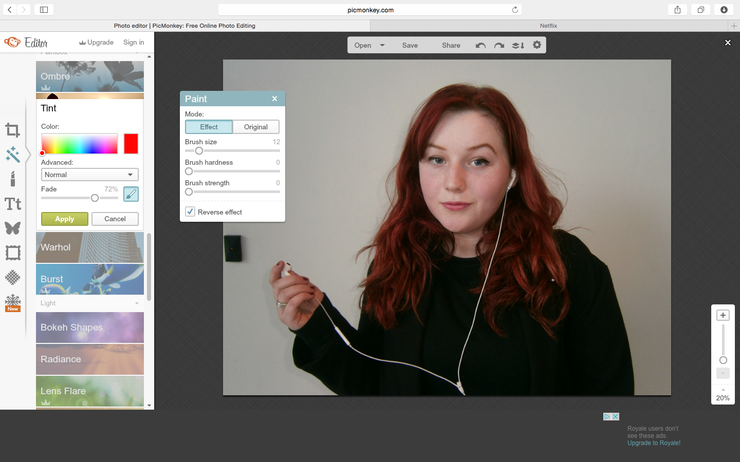 |
| To follow my plan of enhance her bold red hair against the soft, de-saturated background, creating a youthful and stylised look, I used the precisely painted over her hair with the red tint tool. |
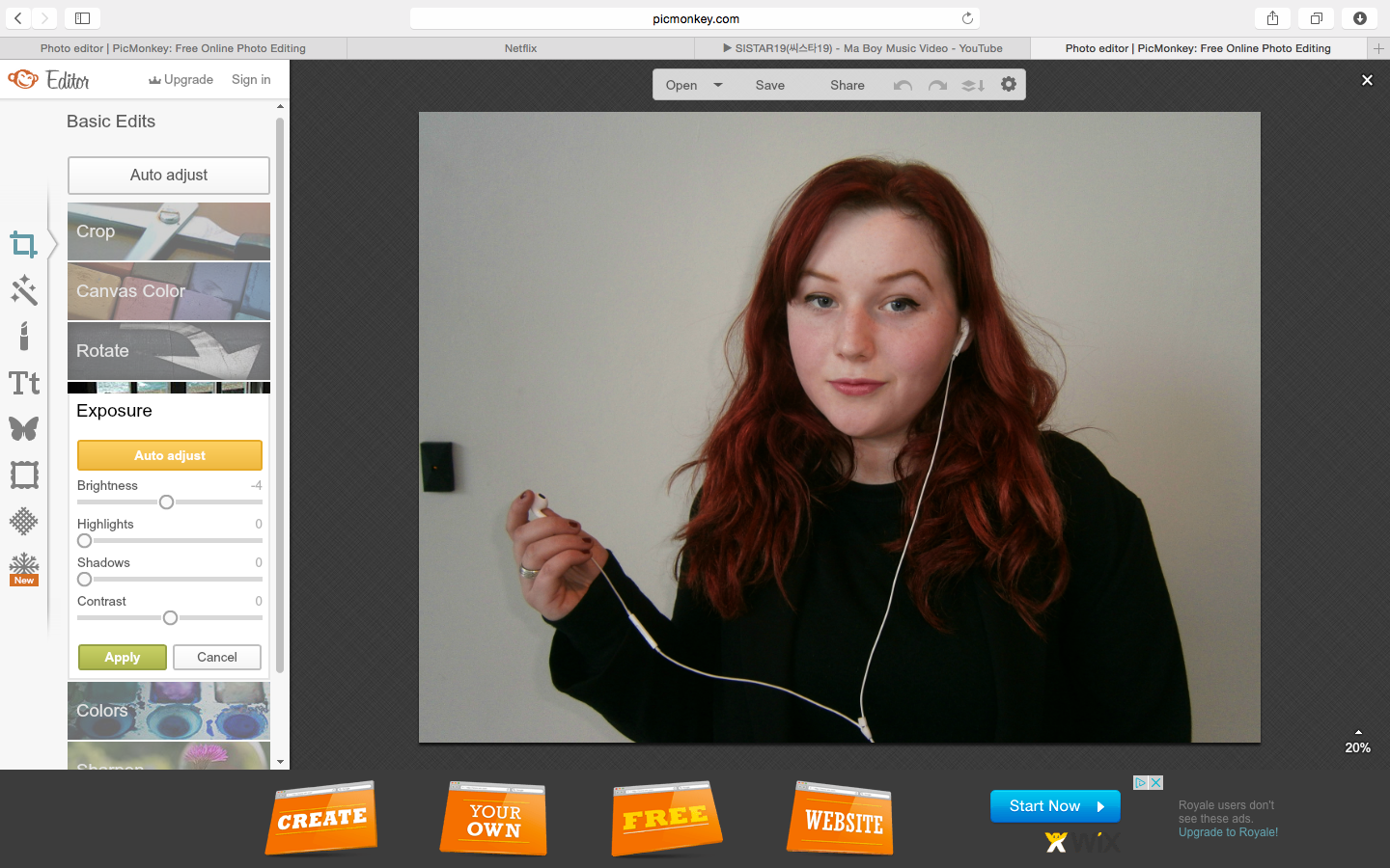 |
| I also experimented with the exposure of the image, and decided to enhance the shadows by reducing brightness, to create a sophisticated, professional background similar to the Channel 4 double page spread within the Radio Times which I am basing my design on. |
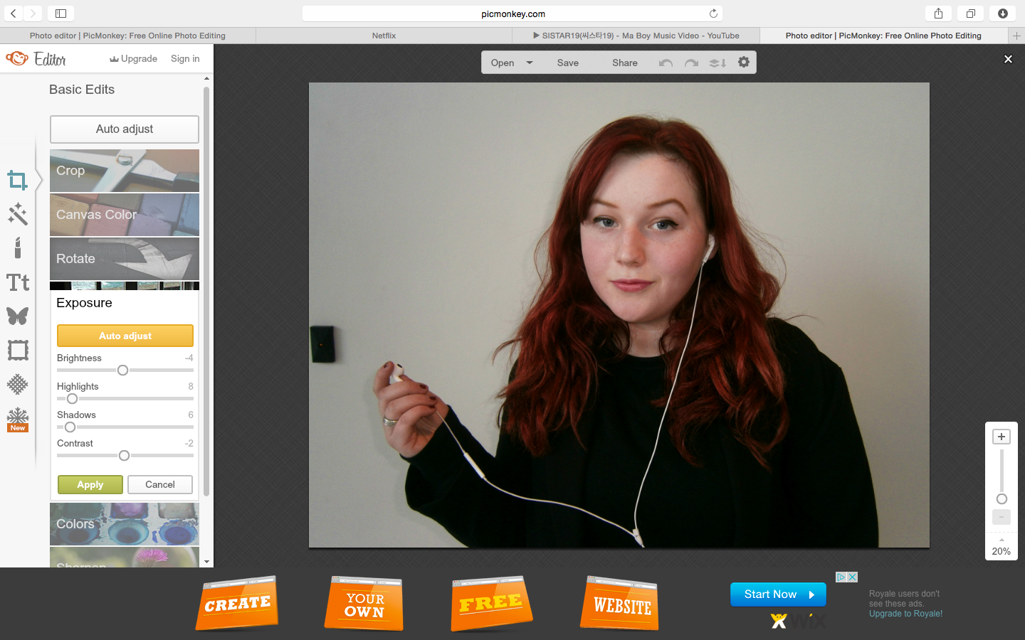 |
| I also enhanced the colours of this image through the highlights and shadow tools, bringing out the boldest colour of my colour scheme; red. |
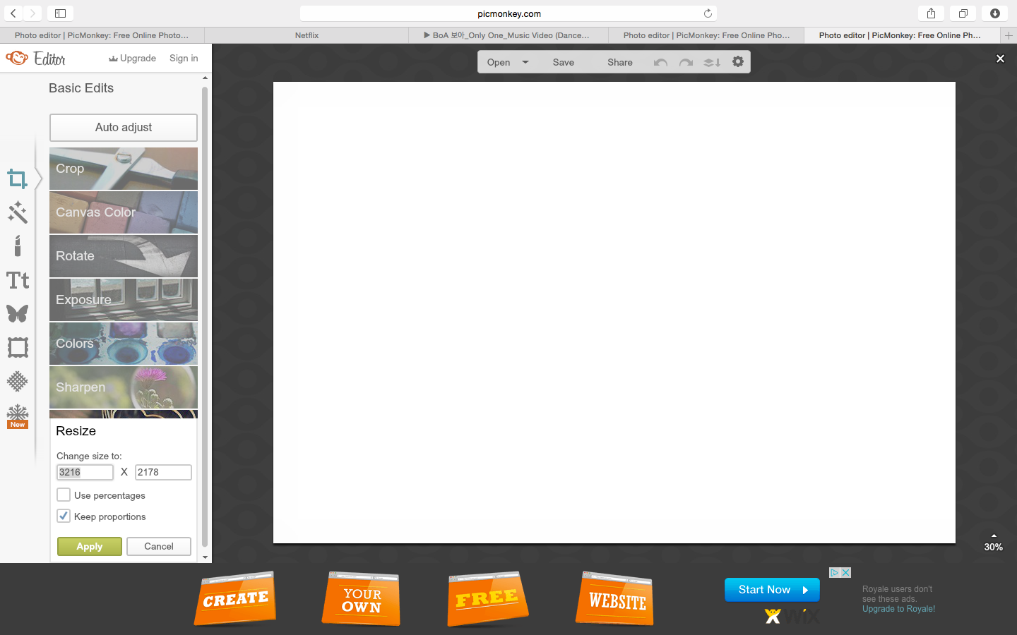 |
| After finishing my edits to the original image which will form the background of my double page spread, I created a new design to create the listings magazine over. I measured the dimensions of a double page of the Radio Times to fit to my exhibitor (w=44cm x h=29.8cm) and resized my canvas to these proportions, with the height as the height of my image to maintain its quality while I edit. I will scale the finished edit to exactly 44x29.8cm using Photoshop. |
 |
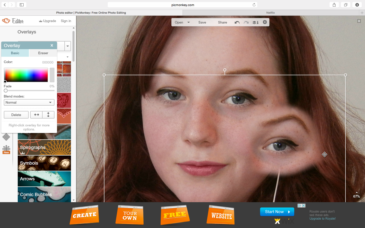
| I then added my edited image as an overlay of this canvas to create the bases of the background. Following the layout of Channel 4's double page spread within the radio times, I aligned Rowan's head which is the focal point of my image within the centre of the right page (so that the text is read first on the left), with her headphone holding hand overlapping the left page to draw attention to this mise en scene as it is broken away from the page (similarly to the Channel 4 article image which draws focus to the drugs John Snow is holding). I added a line in the centre of the canvas to divide the two pages precisely whilst I align my image. |
 |
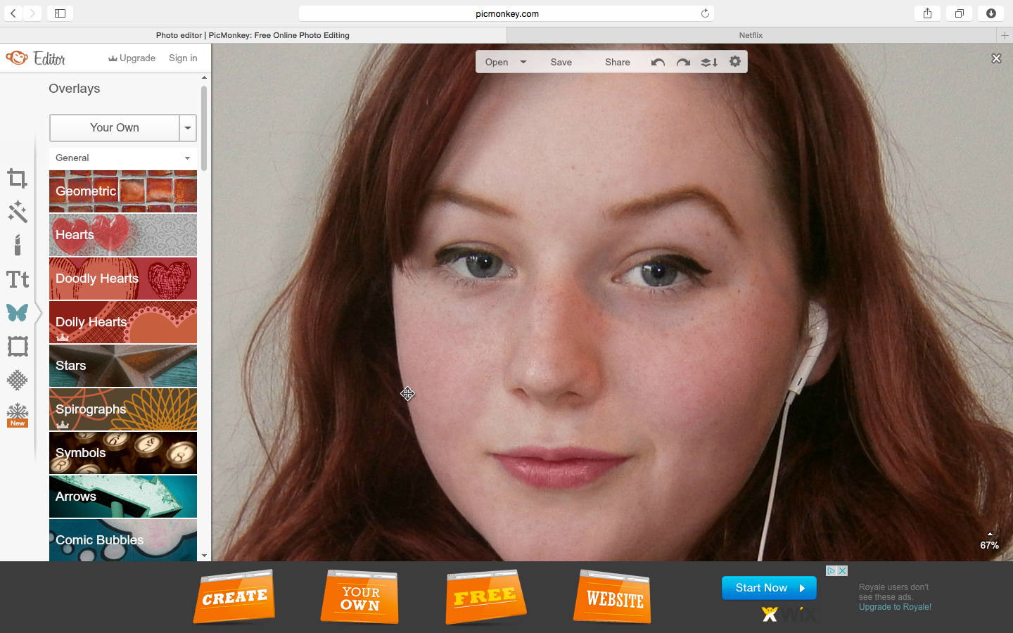
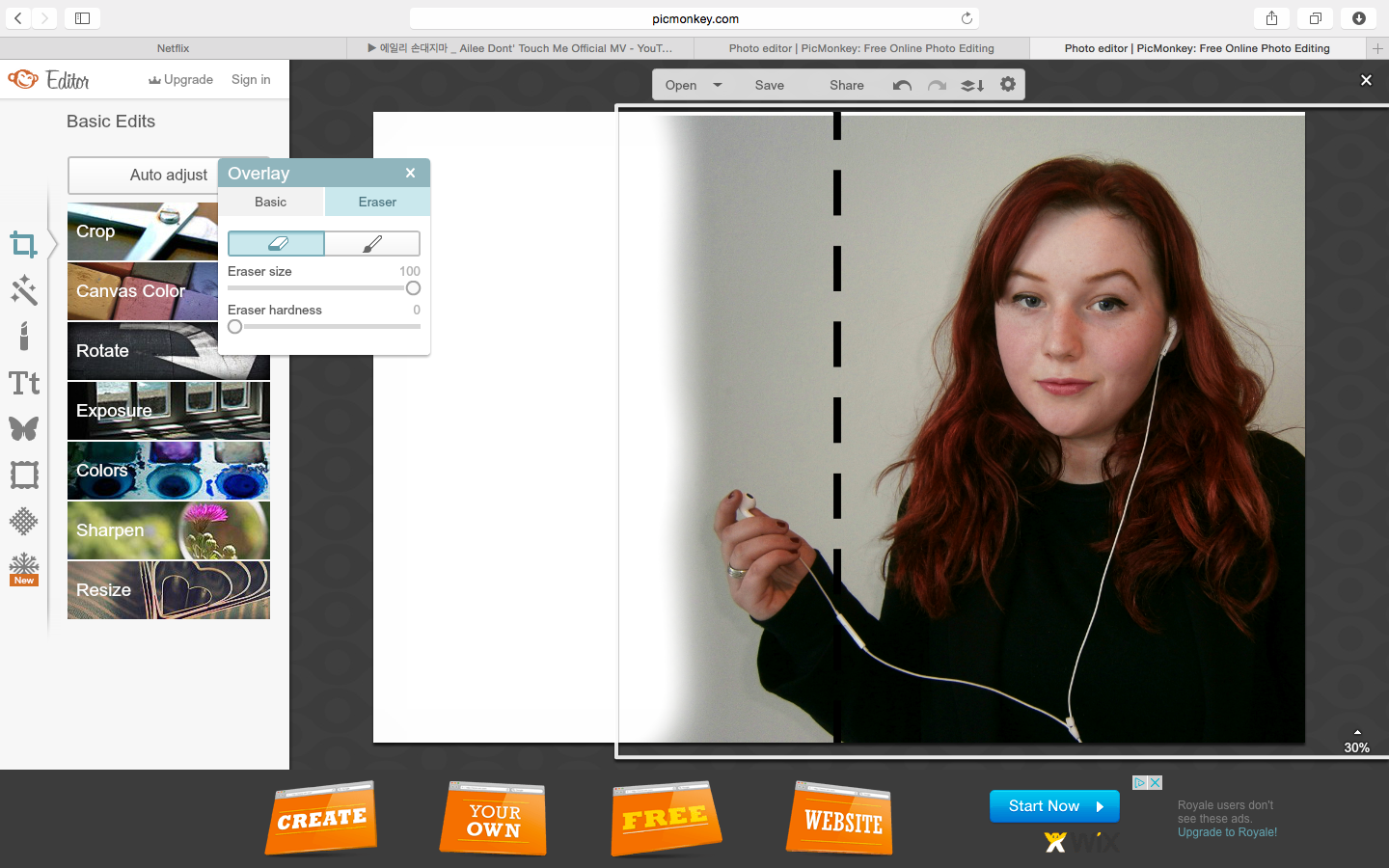
| I then erased the excess background of the image with soft edges to blend the backgrounds, and in a curve following her body to form an artistic shadow due to the darker shades which will contrast with my grey canvas background. |
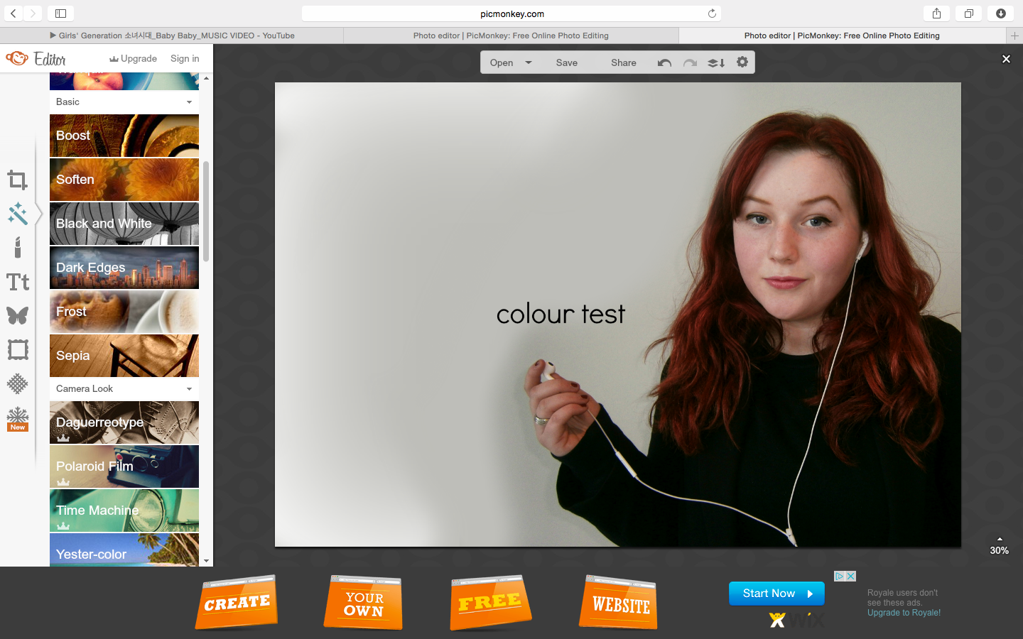 |
| To select a shade of grey which blends with the image background, I used the colour picker tool for changing text colour and copied this colour html code. I then proceeded to blur the edges of the image and background using the soften paint tool, and added a frosted edge precisely using the paint tool to create my planned gradient, shadowed effect - with the lighter background on the left page so that my dark text can be clearly read. |
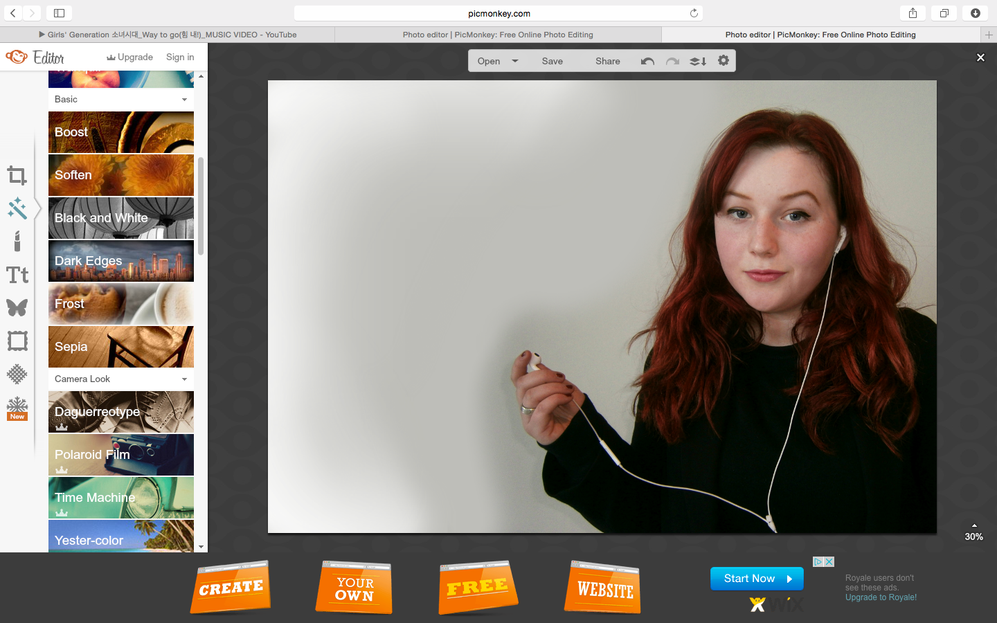 |
| After removing the colour test text and adding more frost to experiment with balancing the light, this is my finished background which I will proceed to add my article, tiles and layout text to (such as page numbers) as planned. |


No comments:
Post a Comment